

| << Chapter < Page | Chapter >> Page > |
When describing a relationships between two categorical variables represented in a two-way table describe any similarities and differences paying particular attention to the largest percentages based on your dominate variable.
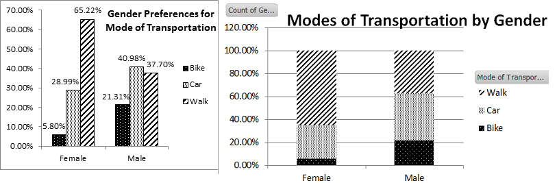
For this relationship there does seem to be a difference between men and women with respect to type of transportation used to get to school. Men are closely split between taking the car at 41% and walking at 37.3%. While the women’s biggest percentage is for walking at 65.3% with driving a car at 29%.
Here is a summary of the steps needed to identify whether you should calculate row or column percentages:
Graphical Displays of Contingency Tables
The relationship you are examining in a contingency table can also be viewed graphically with multiple bar graphs, multiple pie charts or a segmented bar chart. The following graph of Male and Female Modes of Transportation represents all the data from the contingency table in a bar graph using row percents. The graph on the left uses clustered columns to display the data. The graph on the right uses stacked columns to display the data. Also take note that depending on your variable of interest, you can organize your data on the x-axis by mode of transportation or by gender.
This data can also be represented by multiple Pie Charts or Graphs. The graphs below demonstrate how the data can be represented by two pie charts. If we used mode of transportation to define the groups for pie charts, we would need to display three pie charts with the percent male and female on each chart.

When making any of these graphs to show the relationship between the two categorical variables always include the percentages, not the frequencies. The percentages allow us to compare groups with different sample sizes. However, somewhere in your narrative or in the description of your data the actual counts should be represented so that the reader knows the basis of the percentages. Including a contingency table with counts would fill that need.
Another type of relationship between variables that we are interested in examining is between a categorical and numerical variable. All the summary statistics and graphing techniques that we learned about in the previous chapter can be used to compare multiple groups on the same variable. Have you ever wondered who gets more speeding tickets, men or women, or who spends more time studying on your campus, freshmen, sophomores, juniors or seniors? These questions can be examined by constructing multiple histograms, back-to-back stemplots, and multiple box-plots. Below is an example of a box plot showing the differences between the number of hours per week male and female students studied for their statistics course.

When comparing groups with any of these displays we want to pay special attention to differences and similarities is shape, center, spread. You will want to compare the group’s shapes, comment on any gaps, multiple modes or peaks, and outliers you see in the data. This is easy to do when the data is graphed on the same scale as seen in the graphs above.
Next compare and contrast the measures of center: mean, median, and mode. These statistics describe what is a typical response to a numerical question. Are these measurements the same between groups or not.
Lastly, examine their measures of variability: range, standard deviation, and interquartile ranges. Are these measurements of variability and spread similar or different? Remember our purpose in examining these groups is to see if there is a difference. We are looking to see if there is a relationship between the multiple groups.
Professionals often want to know how two or more numeric variables are related. For example, is there a relationship between the grade on the second math exam a student takes and the grade on the final exam? If there is a relationship, what is it and how strong is the relationship?
In another example, your income may be determined by your education, your profession, your years of experience, and your ability. The amount you pay a repair person for labor isoften determined by an initial amount plus an hourly fee. These are all examples in which regression can be used.
The type of data described in the examples is bivariate data - "bi" for two variables. In reality, statisticians use multivariate data, meaning many variables.
In the next section, you will be studying the simplest form of regression, "linear regression" with one independent variable ( ). This involves data that fits a line in two dimensions. You will also study correlation which measures how strong the relationship is.
Notification Switch
Would you like to follow the 'Collaborative statistics using spreadsheets' conversation and receive update notifications?

|
|

|
|

|
|

|
|

|
|

|
|
|
|
|

|
|
|
|
|

|