

| << Chapter < Page | Chapter >> Page > |
| De Anza College | Foothill College | |||||
|---|---|---|---|---|---|---|
| Number | Percent | Number | Percent | |||
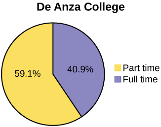
| Full-time | 9,200 | 40.9% | Full-time | 4,059 | 28.6% | |
| Part-time | 13,296 | 59.1% | Part-time | 10,124 | 71.4% | |
| Total | 22,496 | 100% | Total | 14,183 | 100% |
Tables are a good way of organizing and displaying data. But graphs can be even more helpful in understanding the data. There are no strict rules concerning which graphs to use. Two graphs that are used to display qualitative data are pie charts and bar graphs.
In a pie chart , categories of data are represented by wedges in a circle and are proportional in size to the percent of individuals in each category.
In a bar graph , the length of the bar for each category is proportional to the number or percent of individuals in each category. Bars may be vertical or horizontal.
A Pareto chart consists of bars that are sorted into order by category size (largest to smallest).
Look at [link] and [link] and determine which graph (pie or bar) you think displays the comparisons better.
It is a good idea to look at a variety of graphs to see which is the most helpful in displaying the data. We might make different choices of what we think is the “best” graph depending on the data and the context. Our choice also depends on what we are using the data for.


Sometimes percentages add up to be more than 100% (or less than 100%). In the graph, the percentages add to more than 100% because students can be in more than one category. A bar graph is appropriate to compare the relative size of the categories. A pie chart cannot be used. It also could not be used if the percentages added to less than 100%.
| Characteristic/Category | Percent |
|---|---|
| Full-Time Students | 40.9% |
| Students who intend to transfer to a 4-year educational institution | 48.6% |
| Students under age 25 | 61.0% |
| TOTAL | 150.5% |

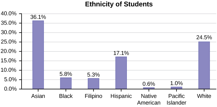
The table displays Ethnicity of Students but is missing the "Other/Unknown" category. This category contains people who did not feel they fit into any of the ethnicity categories or declined to respond. Notice that the frequencies do not add up to the total number of students. In this situation, create a bar graph and not a pie chart.
| Frequency | Percent | |
|---|---|---|
| Asian | 8,794 | 36.1% |
| Black | 1,412 | 5.8% |
| Filipino | 1,298 | 5.3% |
| Hispanic | 4,180 | 17.1% |
| Native American | 146 | 0.6% |
| Pacific Islander | 236 | 1.0% |
| White | 5,978 | 24.5% |
| TOTAL | 22,044 out of 24,382 | 90.4% out of 100% |
The following graph is the same as the previous graph but the “Other/Unknown” percent (9.6%) has been included. The “Other/Unknown” category is large compared to some of the other categories (Native American, 0.6%, Pacific Islander 1.0%). This is important to know when we think about what the data are telling us.
This particular bar graph in [link] can be difficult to understand visually. The graph in [link] is a Pareto chart. The Pareto chart has the bars sorted from largest to smallest and is easier to read and interpret.


Notification Switch
Would you like to follow the 'Introductory statistics' conversation and receive update notifications?

|
|
|
|
|

|
|
|
|
|

|
|

|
|

|
|

|
|

|
|

|
|

|
|

|