

| << Chapter < Page | Chapter >> Page > |
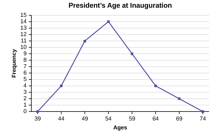
Construct a frequency polygon of U.S. Presidents’ ages at inauguration shown in [link] .
| Age at Inauguration | Frequency |
|---|---|
| 41.5–46.5 | 4 |
| 46.5–51.5 | 11 |
| 51.5–56.5 | 14 |
| 56.5–61.5 | 9 |
| 61.5–66.5 | 4 |
| 66.5–71.5 | 2 |
The first label on the x -axis is 39. This represents an interval extending from 36.5 to 41.5. Since there are no ages less than 41.5, this interval is used only to allow the graph to touch the x -axis. The point labeled 44 represents the next interval, or the first “real” interval from the table, and contains four scores. This reasoning is followed for each of the remaining intervals with the point 74 representing the interval from 71.5 to 76.5. Again, this interval contains no data and is only used so that the graph will touch the x -axis. Looking at the graph, we say that this distribution is skewed because one side of the graph does not mirror the other side.
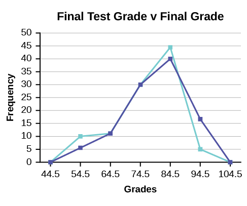
Frequency polygons are useful for comparing distributions. This is achieved by overlaying the frequency polygons drawn for different data sets.
We will construct an overlay frequency polygon comparing the scores from [link] with the students’ final numeric grade.
| Frequency Distribution for Calculus Final Test Scores | |||
|---|---|---|---|
| Lower Bound | Upper Bound | Frequency | Cumulative Frequency |
| 49.5 | 59.5 | 5 | 5 |
| 59.5 | 69.5 | 10 | 15 |
| 69.5 | 79.5 | 30 | 45 |
| 79.5 | 89.5 | 40 | 85 |
| 89.5 | 99.5 | 15 | 100 |
| Frequency Distribution for Calculus Final Grades | |||
|---|---|---|---|
| Lower Bound | Upper Bound | Frequency | Cumulative Frequency |
| 49.5 | 59.5 | 10 | 10 |
| 59.5 | 69.5 | 10 | 20 |
| 69.5 | 79.5 | 30 | 50 |
| 79.5 | 89.5 | 45 | 95 |
| 89.5 | 99.5 | 5 | 100 |
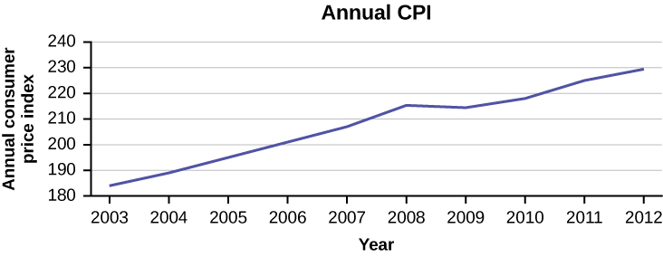
Suppose that we want to study the temperature range of a region for an entire month. Every day at noon we note the temperature and write this down in a log. A variety of statistical studies could be done with this data. We could find the mean or the median temperature for the month. We could construct a histogram displaying the number of days that temperatures reach a certain range of values. However, all of these methods ignore a portion of the data that we have collected.
One feature of the data that we may want to consider is that of time. Since each date is paired with the temperature reading for the day, we don‘t have to think of the data as being random. We can instead use the times given to impose a chronological order on the data. A graph that recognizes this ordering and displays the changing temperature as the month progresses is called a time series graph.
To construct a time series graph, we must look at both pieces of our paired data set . We start with a standard Cartesian coordinate system. The horizontal axis is used to plot the date or time increments, and the vertical axis is used to plot the values of the variable that we are measuring. By doing this, we make each point on the graph correspond to a date and a measured quantity. The points on the graph are typically connected by straight lines in the order in which they occur.
The following data shows the Annual Consumer Price Index, each month, for ten years. Construct a time series graph for the Annual Consumer Price Index data only.
| Year | Jan | Feb | Mar | Apr | May | Jun | Jul |
|---|---|---|---|---|---|---|---|
| 2003 | 181.7 | 183.1 | 184.2 | 183.8 | 183.5 | 183.7 | 183.9 |
| 2004 | 185.2 | 186.2 | 187.4 | 188.0 | 189.1 | 189.7 | 189.4 |
| 2005 | 190.7 | 191.8 | 193.3 | 194.6 | 194.4 | 194.5 | 195.4 |
| 2006 | 198.3 | 198.7 | 199.8 | 201.5 | 202.5 | 202.9 | 203.5 |
| 2007 | 202.416 | 203.499 | 205.352 | 206.686 | 207.949 | 208.352 | 208.299 |
| 2008 | 211.080 | 211.693 | 213.528 | 214.823 | 216.632 | 218.815 | 219.964 |
| 2009 | 211.143 | 212.193 | 212.709 | 213.240 | 213.856 | 215.693 | 215.351 |
| 2010 | 216.687 | 216.741 | 217.631 | 218.009 | 218.178 | 217.965 | 218.011 |
| 2011 | 220.223 | 221.309 | 223.467 | 224.906 | 225.964 | 225.722 | 225.922 |
| 2012 | 226.665 | 227.663 | 229.392 | 230.085 | 229.815 | 229.478 | 229.104 |
| Year | Aug | Sep | Oct | Nov | Dec | Annual |
|---|---|---|---|---|---|---|
| 2003 | 184.6 | 185.2 | 185.0 | 184.5 | 184.3 | 184.0 |
| 2004 | 189.5 | 189.9 | 190.9 | 191.0 | 190.3 | 188.9 |
| 2005 | 196.4 | 198.8 | 199.2 | 197.6 | 196.8 | 195.3 |
| 2006 | 203.9 | 202.9 | 201.8 | 201.5 | 201.8 | 201.6 |
| 2007 | 207.917 | 208.490 | 208.936 | 210.177 | 210.036 | 207.342 |
| 2008 | 219.086 | 218.783 | 216.573 | 212.425 | 210.228 | 215.303 |
| 2009 | 215.834 | 215.969 | 216.177 | 216.330 | 215.949 | 214.537 |
| 2010 | 218.312 | 218.439 | 218.711 | 218.803 | 219.179 | 218.056 |
| 2011 | 226.545 | 226.889 | 226.421 | 226.230 | 225.672 | 224.939 |
| 2012 | 230.379 | 231.407 | 231.317 | 230.221 | 229.601 | 229.594 |
Notification Switch
Would you like to follow the 'Introductory statistics' conversation and receive update notifications?

|
|
|
|
|

|
|

|
|

|
|

|
|

|
|

|
|

|
|

|
|

|
|

|