

| << Chapter < Page | Chapter >> Page > |
Before we take up the discussion of linear regression and correlation, we need to examine a way to display the relation between two variables x and y . The most common and easiest way is a scatter plot . The following example illustrates a scatter plot.
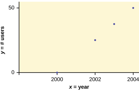
In Europe and Asia, m-commerce is popular. M-commerce users have special mobile phones that work like electronic wallets as well as provide phone and Internet services. Users can do everything from paying for parking to buying a TV set or soda from a machine to banking to checking sports scores on the Internet. For the years 2000 through 2004, was there a relationship between the year and the number of m-commerce users? Construct a scatter plot. Let x = the year and let y = the number of m-commerce users, in millions.
| (year) | (# of users) |
|---|---|
| 2000 | 0.5 |
| 2002 | 20.0 |
| 2003 | 33.0 |
| 2004 | 47.0 |
Amelia plays basketball for her high school. She wants to improve to play at the college level. She notices that the number of points she scores in a game goes up in response to the number of hours she practices her jump shot each week. She records the following data:
| X (hours practicing jump shot) | Y (points scored in a game) |
|---|---|
| 5 | 15 |
| 7 | 22 |
| 9 | 28 |
| 10 | 31 |
| 11 | 33 |
| 12 | 36 |
Construct a scatter plot and state if what Amelia thinks appears to be true.
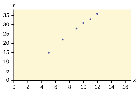
Yes, Amelia’s assumption appears to be correct. The number of points Amelia scores per game goes up when she practices her jump shot more.
A scatter plot shows the direction of a relationship between the variables. A clear direction happens when there is either:
You can determine the strength of the relationship by looking at the scatter plot and seeing how close the points are to a line, a power function, an exponential function, or to some other type of function. For a linear relationship there is an exception. Consider a scatter plot where all the points fall on a horizontal line providing a "perfect fit." The horizontal line would in fact show no relationship.
When you look at a scatterplot, you want to notice the overall pattern and any deviations from the pattern. The following scatterplot examples illustrate these concepts.
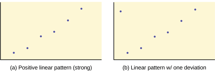
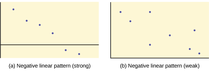
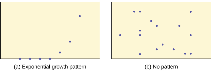
In this chapter, we are interested in scatter plots that show a linear pattern. Linear patterns are quite common. The linear relationship is strong if the points are close to a straight line, except in the case of a horizontal line where there is no relationship. If we think that the points show a linear relationship, we would like to draw a line on the scatter plot. This line can be calculated through a process called linear regression . However, we only calculate a regression line if one of the variables helps to explain or predict the other variable. If x is the independent variable and y the dependent variable, then we can use a regression line to predict y for a given value of x
Scatter plots are particularly helpful graphs when we want to see if there is a linear relationship among data points. They indicate both the direction of the relationship between the x variables and the y variables, and the strength of the relationship. We calculate the strength of the relationship between an independent variable and a dependent variable using linear regression.
Does the scatter plot appear linear? Strong or weak? Positive or negative?
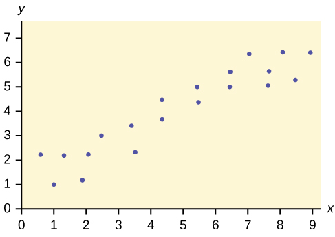
The data appear to be linear with a strong, positive correlation.
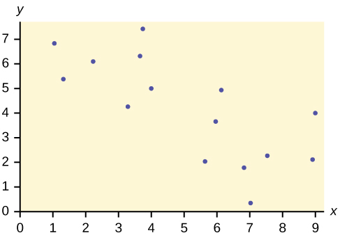
Does the scatter plot appear linear? Strong or weak? Positive or negative?
Does the scatter plot appear linear? Strong or weak? Positive or negative?
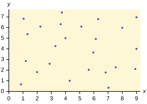
The data appear to have no correlation.
Notification Switch
Would you like to follow the 'Introductory statistics' conversation and receive update notifications?

|
|

|
|

|
|

|
|

|
|

|
|

|
|

|
|

|
|

|
|

|