

| << Chapter < Page | Chapter >> Page > |


Users make choices about the data to be used and its visualization, and these affect both the quality and the quantity of the information presented. Good visualization requires graphical integrity and there are many standard techniques to help quantify and qualify between different versions. As a short exercise three well used simple objective tests (adapted from Tufte (2001)) are presented here as applied to the data shown in Figure 3.
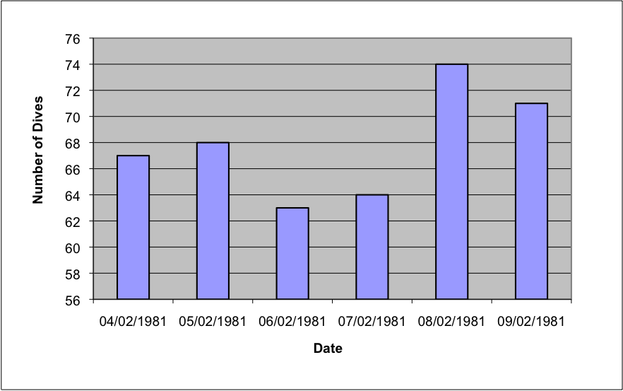

It is possible and recommended to try these kinds of tests and many others on any images including those found in national newspapers.
The visualization of large datasets has become a new key bottleneck in applications where validation of results and data acquisition from scientific equipment is required at an early stage. Such validation would allow correctness of methods (such as the set up of a physical experiment) to be determined prior to further spending of computational or imaging machine resources. Datasets can far exceed the capabilities of modern graphics hardware (GPUs) and so visualization systems are turning to parallel compute facilities to render them.
Figure 4 shows a use case of a current system being developed. Here multiple render processes are executed to render small sections of a decomposed dataset (right hand side). In this case the GPU output from each render process is visible; although usually these windows are not visible and only the left hand composite image is shown. However, this conveys the idea of distributed rendering with the final composited image, shown on the left, viewable by the user. This final real-time interactive image can be transmitted across the internet at fast rates (experience is about 15 frames per second across countries), to be displayed within an application window (as shown), within a portal, or within a Virtual Learning or Research Environment. There is no current national based visualization service in the UK; but various test services exist within JISC and research council funded projects, including on the National Grid Service (NGS (External Link) ) and two initiatives currently running on the UK national supercomputing service (HECToR (External Link) ) are leading the way.
Notification Switch
Would you like to follow the 'Research in a connected world' conversation and receive update notifications?

|
|
|
|
|

|
|

|
|

|
|

|
|

|
|

|
|

|
|

|