

| << Chapter < Page | Chapter >> Page > |

5 Scatter plots
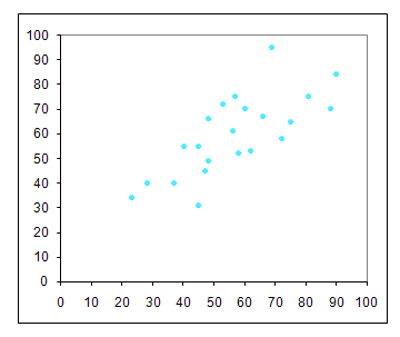
| Pupil: | A | B | C | D | E | F | G | H | I | J | K | L | M | N | O | P | Q | R | S | T | U | V |
| Science | 75 | 45 | 28 | 66 | 58 | 81 | 23 | 69 | 60 | 48 | 72 | 37 | 47 | 90 | 57 | 88 | 45 | 56 | 62 | 40 | 53 | 48 |
| Maths | 65 | 31 | 40 | 67 | 52 | 75 | 34 | 95 | 70 | 66 | 58 | 40 | 45 | 84 | 75 | 70 | 55 | 61 | 53 | 55 | 72 | 49 |
For each learner, the coordinates of the point are (Science mark ; Maths mark). Learner A is (75;65). Can you find the dot? Learner B is (45;31), etc. The squares on the paper are not shown, so that the dots can be seen more clearly.
If the dots lie in a pattern (as these do) roughly from bottom left-hand corner to top right-hand corner, then it means there is a connection between the marks a learner gets for the two subjects.
| LO 5 |
| Data HandlingThe learner will be able to collect, summarise, display and critically analyse data in order to draw conclusions and make predictions and to interpret and determine chance variation. |
| We know this when the learner: |
| 5.1 poses questions relating to human rights, social, economic, environmental and political issues in South Africa; |
| 5.2 selects, justifies and uses appropriate methods for collecting data (alone and/or as a member of a group or team) which include questionnaires and interviews, e x periments, and sources such as books, magazines and the Internet in order to answer questions and thereby draw conclusions and make predictions about the environment; |
| 5.3 organises numerical data in different ways in order to summarise by determining: |
| 5.3.1 measures of central tendency; |
| 5.3.2 measures of dispersion; |
| 5.4 draws a variety of graphs by hand/technology to display and interpret data including: |
| 5.4.1 bar graphs and double bar graphs; |
Notification Switch
Would you like to follow the 'Mathematics grade 9' conversation and receive update notifications?

|
|

|
|

|
|

|
|
|
|
|

|
|

|
|

|
|

|
|
|
|