Often, cruise ships conduct all on-board transactions, with the exception of gambling, on a cashless basis. At the end of the cruise, guests pay one bill that covers all on-board transactions. Suppose that 60 single travelers and 70 couples were surveyed as to their on-board bills for a seven-day cruise from Los Angeles to the Mexican Riviera. Below is a summary of the bills for each group.
Singles
Amount($)
Frequency
Rel. Frequency
51-100
5
101-150
10
151-200
15
201-250
15
251-300
10
301-350
5
Couples
Amount($)
Frequency
Rel. Frequency
100-150
5
201-250
5
251-300
5
301-350
5
351-400
10
401-450
10
451-500
10
501-550
10
551-600
5
601-650
5
Fill in the relative frequency for each group.
Construct a histogram for the Singles group. Scale the x-axis by $50. widths. Use relative frequency on the y-axis.
Construct a histogram for the Couples group. Scale the x-axis by $50. Use relative frequency on the y-axis.
Compare the two graphs:
List two similarities between the graphs.
List two differences between the graphs.
Overall, are the graphs more similar or different?
Construct a new graph for the Couples by hand. Since each couple is paying for two individuals, instead of scaling the x-axis by $50, scale it by $100. Use relative frequency on the y-axis.
Compare the graph for the Singles with the new graph for the Couples:
List two similarities between the graphs.
Overall, are the graphs more similar or different?
By scaling the Couples graph differently, how did it change the way you compared it to the Singles?
Based on the graphs, do you think that individuals spend the same amount, more or less, as singles as they do person by person in a couple? Explain why in one or two complete sentences.
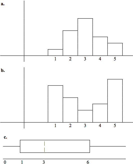
Refer to the following histograms and box plot. Determine which of the following are true and which are false. Explain your solution to each part in complete sentences.
The medians for all three graphs are the same.
We cannot determine if any of the means for the three graphs is different.
The standard deviation for (b) is larger than the standard deviation for (a).
We cannot determine if any of the third quartiles for the three graphs is different.
True
True
True
False
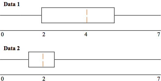
Refer to the following box plots.
In complete sentences, explain why each statement is false.
Data 1 has more data values above 2 than
Data 2 has above 2.
The data sets cannot have the same mode.
For
Data 1 , there are more data values below 4 than there are above 4.
For which group, Data 1 or Data 2, is the value of “7” more likely to be an outlier?
Explain why in complete sentences
The median age of the U.S. population in 1980 was 30.0 years. In 1991, the median age was 33.1 years. (
Source: Bureau of the Census )
What does it mean for the median age to rise?
Give two reasons why the median age could rise.
For the median age to rise, is the actual number of children less in 1991 than it was in 1980? Why or why not?
Maybe
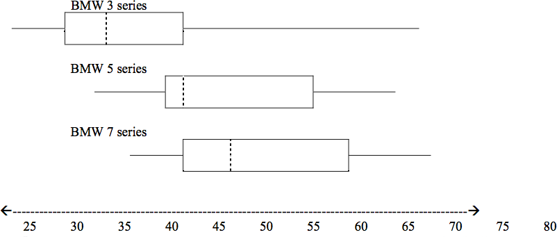
A survey was conducted of 130 purchasers of new BMW 3 series cars, 130 purchasers of new BMW 5 series cars, and 130 purchasers of new BMW 7 series cars. In it, people were asked the age they were when they purchased their car. The following box plots display the results.
In complete sentences, describe what the shape of each box plot implies about the distribution of the data collected for that car series.
Which group is most likely to have an outlier? Explain how you determined that.
Compare the three box plots. What do they imply about the age of purchasing a BMW from the series when compared to each other?
Look at the BMW 5 series. Which quarter has the smallest spread of data? What is that spread?
Look at the BMW 5 series. Which quarter has the largest spread of data? What is that spread?
Look at the BMW 5 series. Estimate the Inter Quartile Range (IQR).
Look at the BMW 5 series. Are there more data in the interval 31-38 or in the interval 45-55? How do you know this?
Look at the BMW 5 series. Which interval has the fewest data in it? How do you know this?
Receive real-time job alerts and never miss the right job again
Source:
OpenStax, Collaborative statistics using spreadsheets. OpenStax CNX. Jan 05, 2016 Download for free at http://legacy.cnx.org/content/col11521/1.23
Google Play and the Google Play logo are trademarks of Google Inc.
Notification Switch
Would you like to follow the 'Collaborative statistics using spreadsheets' conversation and receive update notifications?