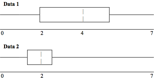
In complete sentences, explain why each statement is false.
Data 1 has more data values above 2 than
Data 2 has above 2.
The data sets cannot have the same mode.
For
Data 1 , there are more data values below 4 than there are above 4.
For which group, Data 1 or Data 2, is the value of “7” more likely to be an outlier?
Explain why in complete sentences
In a recent issue of the
IEEE Spectrum , 84 engineering conferences were announced. Four conferences lasted two days. Thirty-six lasted three days. Eighteen lasted four days. Nineteen lasted five days. Four lasted six days. One lasted seven days. One lasted eight days. One lasted nine days. Let X = the length (in days) of an engineering conference.
Organize the data in a chart.
Find the median, the first quartile, and the third quartile.
Find the 65th percentile.
Find the 10th percentile.
Construct a box plot of the data.
The middle 50% of the conferences last from _______ days to _______ days.
Calculate the sample mean of days of engineering conferences.
Calculate the sample standard deviation of days of engineering conferences.
Find the mode.
If you were planning an engineering conference, which would you choose as the length of the conference: mean; median; or mode? Explain why you made that choice.
Give two reasons why you think that 3 - 5 days seem to be popular lengths of engineering conferences.
4,3,5
4
3
3,5
3.94
1.28
3
mode
A survey of enrollment at 35 community colleges across the United States yielded the following figures (
source: Microsoft Bookshelf ):
6414
1550
2109
9350
21828
4300
5944
5722
2825
2044
5481
5200
5853
2750
10012
6357
27000
9414
7681
3200
17500
9200
7380
18314
6557
13713
17768
7493
2771
2861
1263
7285
28165
5080
11622
Organize the data into a chart with five intervals of equal width. Label the two columns
"Enrollment"and
"Frequency."
Construct a histogram of the data.
If you were to build a new community college, which piece of information would be more valuable: the mode or the mean?
Calculate the sample mean.
Calculate the sample standard deviation.
A school with an enrollment of 8000 would be how many standard deviations away from the mean?
The median age of the U.S. population in 1980 was 30.0 years. In 1991, the median age was 33.1 years. (
Source: Bureau of the Census )
What does it mean for the median age to rise?
Give two reasons why the median age could rise.
For the median age to rise, is the actual number of children less in 1991 than it was in 1980? Why or why not?
Maybe
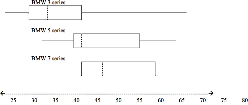
A survey was conducted of 130 purchasers of new BMW 3 series cars, 130 purchasers of new BMW 5 series cars, and 130 purchasers of new BMW 7 series cars. In it, people were asked the age they were when they purchased their car. The following box plots display the results.
In complete sentences, describe what the shape of each box plot implies about the distribution of the data collected for that car series.
Which group is most likely to have an outlier? Explain how you determined that.
Compare the three box plots. What do they imply about the age of purchasing a BMW from the series when compared to each other?
Look at the BMW 5 series. Which quarter has the smallest spread of data? What is that spread?
Look at the BMW 5 series. Which quarter has the largest spread of data? What is that spread?
Look at the BMW 5 series. Estimate the Inter Quartile Range (IQR).
Look at the BMW 5 series. Are there more data in the interval 31-38 or in the interval 45-55? How do you know this?
Look at the BMW 5 series. Which interval has the fewest data in it? How do you know this?