

| << Chapter < Page | Chapter >> Page > |
In some data sets, there are values (observed data points) called outliers . Outliers are observed data points that are far from the least squares line. They have large "errors", where the "error" or residual is the vertical distance from the line to the point.
Outliers need to be examined closely. Sometimes, for some reason or another, they should not be included in the analysis ofthe data. It is possible that an outlier is a result of erroneous data. Other times, an outlier may hold valuable information about the population under study and should remain included in the data. The key is to carefully examinewhat causes a data point to be an outlier.
Besides outliers, a sample may contain one or a few points that are called influential points . Influential points are observed data points that are far from the other observed data points but that greatly influence the line. As a result an influential point may be close to the line, even though it is far from the rest of the data. Because an influential point so strongly influences the best fit line, it generally will not have a large "error" or residual.
Computers and many calculators can be used to identify outliers from the data. Computer output for regression analysis will often identify both outliers and influential points so that you can examine them.
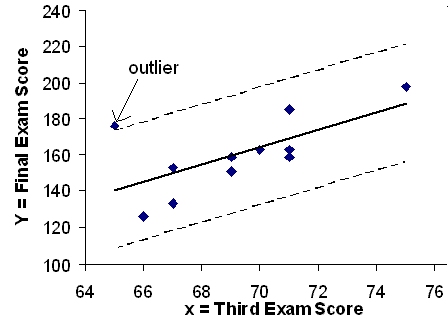
We can do this visually in the scatterplot by drawing an extra pair of lines that are two standard deviations above and below the best fit line. Any data points that are outside this extra pair of lines are flagged as potential outliers. Or we can do this numerically by calculating each residual and comparing it to twice the standard deviation. On the TI-83, 83+, or 84+, the graphical approach is easier. The graphical procedure is shown first, followed by the numerical calculations. You would generally only need to use one of these methods.
In the third exam/final exam example , you can determine if there is an outlier or not. If there is an outlier, as an exercise, delete it and fit the remaining data to a new line. For thisexample, the new line ought to fit the remaining data better. This means the SSE should be smaller and the correlation coefficient ought to be closer to 1 or -1.
As we did with the equation of the regression line and the correlation coefficient, we will use technology to calculate this standard deviation for us. Using the LinRegTTest with this data, scroll down through the output screens to find s=16.412
Line Y2=-173.5+4.83x-2(16.4) and line Y3=-173.5+4.83X+2(16.4)
Graph the scatterplot with the best fit line in equation Y1, then enter the two extra lines as Y2 and Y3 in the "Y="equation editor and press ZOOM 9. You will find that the only data point that is not between lines Y2 and Y3 is the point x=65, y=175. On the calculator screen it is just barely outside these lines. The outlier is the student who had a grade of 65 on the third exam and 175 on the final exam; this point is further than 2 standard deviations away from the best fit line.
Sometimes a point is so close to the lines used to flag outliers on the graph that it is difficult to tell if the point is between or outside the lines. On a computer, enlarging the graph may help; on a small calculator screen, zooming in may make the graph more clear. Note that when the graph does not give a clear enough picture, you can use the numerical comparisons to identify outliers.
is the standard deviation of all the values where = the total number of data points. If each residual is calculated and squared, and the results are added up, we get the SSE. The standard deviation of the residuals is calculated from the SSE as:
Rather than calculate the value of s ourselves, we can find s using the computer or calculator. For this example, our calculator LinRegTTest found s=16.4 as the standard deviation of the residuals:
| 65 | 175 | 140 | |
| 67 | 133 | 150 | |
| 71 | 185 | 169 | |
| 71 | 163 | 169 | |
| 66 | 126 | 145 | |
| 75 | 198 | 189 | |
| 67 | 153 | 150 | |
| 70 | 163 | 164 | |
| 71 | 159 | 169 | |
| 69 | 151 | 160 | |
| 69 | 159 | 160 |
We are looking for all data points for which the residual is greater than 2s=2(16.4)=32.8 or less than -32.8. Compare these values to the residuals in column 4 of the table. The only such data point is the student who had a grade of 65 on the third exam and 175 on the final exam; the residual for this student is 35.
and
The new line with is a stronger correlation than the original ( =0.6631) because is closer to 1. This means that the new line is a better fit to the 10 remaining data values. The line can better predict the final exam score given the third exam score.
Using this new line of best fit (based on the remaining 10 data points), what would a student who receives a 73 on the third exam expect to receive on the final exam? Is this the same as the prediction made using the original line?
Using the new line of best fit = 184.28. A student who scored 73 points on the third exam would expect to earn 184 points on the final exam.
The original line predicted = 179.08 so the prediction using the new line with the outlier eliminated differs from the original prediction.
( From The Consumer Price Indexes Web site ) The Consumer Price Index (CPI) measures the average change over time in the prices paid by urban consumers forconsumer goods and services. The CPI affects nearly all Americans because of the many ways it is used. One of its biggest uses is as a measure of inflation. By providing information aboutprice changes in the Nation's economy to government, business, and labor, the CPI helps them to make economic decisions. The President, Congress, and the Federal Reserve Board use theCPI's trends to formulate monetary and fiscal policies. In the following table, is the year and is the CPI.
| 1915 | 10.1 |
| 1926 | 17.7 |
| 1935 | 13.7 |
| 1940 | 14.7 |
| 1947 | 24.1 |
| 1952 | 26.5 |
| 1964 | 31.0 |
| 1969 | 36.7 |
| 1975 | 49.3 |
| 1979 | 72.6 |
| 1980 | 82.4 |
| 1986 | 109.6 |
| 1991 | 130.7 |
| 1999 | 166.6 |
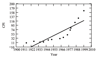
If you are interested in seeing more years of data for example 3, visit the Bureau of Labor Statistics CPI website ftp://ftp.bls.gov/pub/special.requests/cpi/cpiai.txt ; our data is taken from the column entitled "Annual Avg." (third column from the right). For example you could add more current years of data. Try adding the more recent years 2004 : CPI=188.9 and 2008 : CPI=215.3 and see how it affects the model.
Notification Switch
Would you like to follow the 'Collaborative statistics: custom version modified by v moyle' conversation and receive update notifications?

|
|

|
|

|
|

|
|

|
|

|
|

|
|

|
|

|
|

|