Now that you have finished taking all of your GLOBE measurements, today you will be able to analyze the data you have collected. You have been measuring surface and air temperature, wind, humidity, types of cloud cover, and the amount of ozone outside. Your goal is to understand how the amount of ozone found in the air is related to the measurements. You will be able to do this by doing simple calculations and creating charts, graphs, and pictures to represent your data. This way you can visually see your data in an easy way and look at different trends. For example you will be able to answer the following question:
How does air temperature relate to the amount of low-level ozone in the air? Does ozone increase or decrease when temperature is warmer?
Analyzing the data in this way will help you see whether the data supports the hypotheses you made during Lesson Five. You will then be able to come up with a conclusion that you can share with other students and your teacher.
Good luck!
Globe measurements
Now that you have finished taking five sets of GLOBE measurements, today you will compile the data you have gotten, and look at it for interesting trends.
Get out your GLOBE Measurement Data Sheets.
Fill in the “AQI” row with the correct “Health Word” from the chart below.
Find the average air temperature on each measurement day by averaging the air temperature from the beginning and end of class. Record your answers, along with each day’s ozone concentration, in the chart below.
Now we are going to make a graph so we can see how the amount of ozone in the air is related to the average air temperature. On the graph below, Average Air Temperature (⁰ C) is the x-axis, and Ozone Concentration (parts per billion) is the y-axis. Plot the data from the chart above onto the graph below. Draw a dot (●) for each day of measurements.
How is humidity related to the concentration of ozone in the air? Let’s find out by graphing Humidity (%) on the x-axis and Ozone Concentration (parts per billion) on the y-axis.
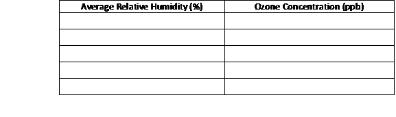
Find the average relative humidity by averaging the relative humidity when the ozone strip was exposed and when the ozone strip was read for each day.
Record your answers and the ozone concentration for each day in the chart below:
Plot the data from the chart onto the graph below. Draw a dot (●) for each day of measurements.
Finally, let’s look at the surface temperatures that you took in three different places. Did you perhaps notice that some types of surfaces are consistently hotter or colder than other types of surfaces? Let’s create a line graph so that we more easily see if this is true.
The y-axis of the graph will have surface temperature in Celsius and the x-axis will have the days you took the temperature.
Color in the Legend below the graph, choosing one color for each surface. For example, you could choose green for Surface Temperature #1, red for Surface Temperature #2, and black for Surface Temperature #3. Write a name for each surface explaining where it was measured (e.g., “grassy field”).
Graph Surface Temperature #1 by drawing 5 dots for the temperature found each day, using the color from your Legend. Connect the dots to create a line graph.
Then, do the same thing for Surface Temperature #2 and Surface Temperature #3. You will end with three differently-colored lines on your graph.
Is there a type of surface that is consistently cooler or warmer than the others? Why is this so?
Consider your Ozone Concentration versus Average Air Temperature graph. Can you see any relationship between ozone concentration and air temperature? Does ozone increase or decrease when air temperature increases? Fill in the first row of the Table below with your answer.
Now consider your Ozone Concentration versus Relative Humidity graph. Do you see any relationship between humidity and ozone concentration? Fill in the second row of the Table below with your answer.
Now look at your Data Sheet. Do you see any relationship between Cloud Cover and ozone concentration? Fill in the third row of the Table below.
Now look back at the chart you filled in during Lesson Five with your hypotheses. Were your hypotheses supported by the data that you measured?
Positive Correlation means that when air temperature, humidity, or cloud cover increased, ozone concentration increased.
Negative Correlation means that if air temperature, humidity, or cloud cover increased, ozone concentration decreased.
No Correlation means that there is no clear relationship in the data.
Reflection
Now that you have completed all of the lessons and have analyzed all of your measurements, what have you learned? Take a moment to reflect on your experiences in measuring and learning about the atmosphere.
What did you find most fun about the lessons?
What were the 3 most interesting facts that you learned?
Were you surprised by any of the relationships you found in your data? Remember, five days of measurements is only a beginning for evaluating hypotheses, so it’s ok if you found some unexpected relationships.