Learn about the class named Item. Then learn how to create a Form and how to populate it with objects of the following classes: String, StringItem, Image, ImageItem, ChoiceGroup, DateField, Gauge (interactive), Gauge (non-interactive), Spacer, and TextField. Also learn about layout directives and appearance modes.
Published: May 20, 2008
By Richard G. Baldwin
Java Programming Notes # 2584
This is one in a series of tutorial lessons designed to teach you how to write programs using the Sun Java Wireless Toolkit for CLDC. The first lesson was titled Getting Started with MIDlets and the Sun Java Wireless Toolkit for CLDC. The previous lesson was titled Using Lists in MIDlets (see Resources).
What you will learn
In this lesson, you will learn about the class named Item. Then you will learn how to create a Form and how to populate it with objects of the following classes:
You will also learn about layout directives and appearance modes.
A MIDlet development framework
For this lesson, you will need the updated version of the MIDlet development framework named WTKFramework03, which was provided in the earlier lesson titled Using Alerts, Images, Timers, and Gauges in MIDlets (see Resources).
I recommend that you open another copy of this document in a separate browser window and use the following links to easily find and view the figures and listings while you are reading about them.
I recommend that you also study the other lessons in my extensive collection of online Java tutorials. You will find a consolidated index at www.DickBaldwin.com.
A partial class hierarchy for MIDP 2.0 is shown in Figure 1.
Figure 1. Partial class hierarchy for MIDP 2.0.
|
I have discussed and illustrated the classes shown in boldface Italics in earlier lessons (see Resources). I will discuss and illustrate the following classes in this lesson:
I will discuss and illustrate the Canvas and GameCanvas classes in future lessons. I will leave CustomItem as an exercise for the student.
As you can see in Figure 1, the Form class is one of four classes that extend the Screen class. These four classes constitute the high-level user interface components that are available in MIDP 2.0. The use of the Form class is considerably more complicated than the use of any of the other three.
Here is part of what Sun has to say about the Form class:
"A Form is a Screen that contains an arbitrary mixture of items: images, read-only text fields, editable text fields, editable date fields, gauges, choice groups, and custom items. In general, any subclass of the Item class may be contained within a form. The implementation handles layout, traversal, and scrolling. The entire contents of the Form scrolls together."
Methods of the Form class
Perhaps the best way to begin understanding that complexity is to take a look at the methods belonging to the Form class.
Figure 2. Methods of the Form class.
|
Adding items to a Form
I have separated the methods in Figure 2 into five functional groups to make it easer to understand them. The three methods in the first group are used to add items to the Form. The thing that these three methods have in common is that they all require an incoming parameter of type Item.
Adding strings and images to a Form
The two methods in the second group are also used to add items to the Form. The thing that sets them apart from the first group is that they don't require incoming parameters of type Item. Note however, that the behavior of these two methods is identical to the following:
Thus, these two methods are simply specialized shorthand versions of the first method in the first group for use with strings and images. (You will learn more about the classes named StringItem and ImageItem later in this lesson. Suffice it for now to say that they are both subclasses of the Item class.)
Deleting items from a Form
The delete methods in Group 3 are self-explanatory.
The getter methods
The first get method in Group 4 gets a reference to the item at the specified index without changing the contents of the Form. The remaining three getter methods in Group 4 are used to get the values of common properties of the Form.
Interactive programming
The single method in Group 5 is used for interactive programming, which will be the topic of a future lesson.
Numeric indices
Items within a Form are referred to by numeric indices ranging from zero to size()-1. The index value zero refers to the first item in the Form.
The layout of a form is far too complex to be explained in detail in this lesson, so you are encouraged to avail yourself of the Sun documentation. Here are a few layout highlights.
Layout is based on rows
The layout of a Form is based on rows of items. All rows in a Form have the same width.
The height of a Form
Forms grow vertically and scroll vertically as necessary. For example, with the Sun cell phone emulator, a Form that is taller than the screen can be scrolled vertically using the up and down arrow keys on the cell phone keypad (see Figure 3). The height of a Form varies depending upon the number of rows and the height of each row. The height of each row is determined by the items that are positioned on that row. Rows need not all have the same height.
Multiple items can appear on each row
A cell phone may choose to lay out Items in a left-to-right or right-to-left direction depending upon the language conventions in use.
According to Sun,
"Items are laid out at the beginning of each row, proceeding across each row in the chosen layout direction, packing as many Items onto each row as will fit, unless a condition occurs that causes the packing of a row to be terminated early. A new row is then added, and Items are packed onto it as described above. Items are packed onto rows, and new rows are added below existing rows as necessary until all Items have been processed by the layout algorithm."
Also according to Sun,
"The layout algorithm generally attempts to place an item on the same row as the previous item, unless certain conditions occur that cause a "row break." When there is a row break, the current item will be placed at the beginning of a new row instead of being placed after the previous item, even if there is room."
Conditions for "row breaks"
There are a variety of conditions that can produce a "row break" including, for example, the inclusion of "\n" in the contents of a String or StringItem. The process for determining whether a new item will appear on the same row or on the next row is very complicated. If you are planning on producing J2ME products, I recommend that you study this portion of the documentation very carefully.
The current alignment
The layout algorithm has a concept of a current alignment with the following values:
If the layout direction is left-to-right, the initial alignment value is LAYOUT_LEFT. Similarly, if the layout direction is right-to-left, the initial alignment is LAYOUT_RIGHT.
The current alignment persists as new items are added to the form. The current alignment can be changed by adding a new Item that was constructed using a layout directive that is different from the current alignment. Not all constructors for Item subclasses allow for a layout directive. However, all subclasses of Item inherit a method named setLayout, which can be used to change the current alignment.
A sample Form
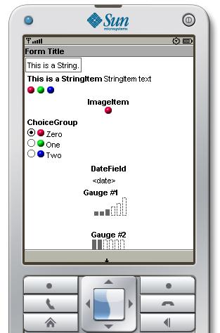
Before going further, it will probably be useful to show you the initial output produced on the Sun cell phone emulator for the MIDlet named Form01. That output is shown in Figure 3. Some of the items in the Form are interactive. Figure 3 shows the output before any user interaction has taken place.
Figure 3. Initial output from the MIDlet named Form01.
|
|
The contents of the Form
Starting at the top left and working down and to the right, you can see the following items in Figure 3.
|
Visual indication of off-screen items
The tiny arrow in the gray area immediately below Gauge #2 is a visual indication that there are items that are not visible off the bottom of the screen. They can be exposed using the down arrow key on the cell phone keypad. If you scroll all the way down and cause some items to go off the top of the screen, the direction of the tiny arrow changes so that it is pointing up. If there are items that are off the screen at both the top and the bottom, the tiny arrow is replaced by two arrows that point up and down.
According to Sun, the Item class is
"A superclass for components that can be added to a Form."
Forms require objects of type Item
Regardless of the fact that there are shorthand methods that seem to make it possible to place objects of type String and type Image in a form, only objects of type Item can be placed in a Form. (The String object and the Image object are used to construct objects of type StringItem and ImageItem behind the scenes when these two shorthand methods are called.) Therefore, it will be useful for us to examine the Item class in some detail.
The item label
All Item objects have a label field. This field contains a String, (which may be null). Unless null, the label is typically displayed near the component when it is displayed on the screen. For example, all of the items in Figure 3 display a label except for the String at the top and the three Image objects on the third row. As explained earlier, these objects were used to create Item objects for which the label was set to null.
According to Sun,
"The implementation should attempt to distinguish label strings from other textual content, possibly by displaying the label in a different font, aligning it to a different margin, or appending a colon to it if it is placed on the same line as other string content. If the screen is scrolling, the implementation should try to keep the label visible at the same time as the Item."
In Figure 3, for example, the Sun cell phone emulator displayed all of the labels in boldface.
Switching to a system-generated screen
Also according to Sun,
"In some cases, when the user attempts to interact with an Item, the system will switch to a system-generated screen where the actual interaction takes place. If this occurs, the label will generally be carried along and displayed within this new screen in order to provide the user with some context for the operation. For this reason it is recommended that applications supply a label to all interactive Item objects. However, this is not required, and a null value for a label is legal and specifies the absence of a label."
We will see an example of a system-generated screen later when we examine the DateField class.
More on layout
In the earlier discussion of Form layout, I told you that layout is a very complex topic and provided a few highlights. To reinforce the complexity of layout, the following list shows a large number of constants that can be used for layout directives in addition to left, right, and center alignment:
Some of these layout directives are mutually exclusive, such as left, center, and right alignment. Other layout directives can be combined using the bit-wise inclusive OR operator ( | ) to compose a layout directive value. Beyond that, I will leave it as an exercise for the student to study this topic in detail.
The size of an Item
Another relatively complex topic is the size of an Item. This includes the concept of a minimum size and a preferred size, both of which refer to the total area of the Item. The total area includes space for the item's contents and the item's label plus other space that is significant with respect to layout.
According to Sun,
"The minimum size is the smallest size at which the Item can function and display its contents, though perhaps not optimally."
Continuing with information from Sun,
"The preferred size is generally a size based on the Item's contents and is the smallest size at which no information is clipped and text wrapping (if any) is kept to a tolerable minimum."
Beyond this brief introduction, I will leave the study of item sizes as an exercise for the student.
The appearance mode
The StringItem and ImageItem classes, (which we will discuss later) have an appearance mode attribute that can be set in their constructors.
Although the words HYPERLINK and BUTTON suggest interactive capability, it is important to understand that these modes apply to the appearance of the Item and not to the interactive nature of the Item. To support interactive programming, you must associate one or more Commands and a CommandListener with the Item. (Commands and CommandListeners will be the topic of a future lesson.)
Also as you will see later, setting the appearance mode to BUTTON may have no impact on the appearance at all.
Methods of the Item class
The Item class is an abstract class. Only objects instantiated from subclasses of Item can be added to a Form. All subclasses of Item inherit all of the methods that are defined in the Item class, which they may or may not choose to override. Therefore, before attacking the subclasses of the Item class, it will be useful to understand the methods defined in the Item class.
Figure 4 shows the name, formal argument list, and a description of each method.
Figure 4. Methods of the Item class.
|
Separated into groups
I have separated the methods in Figure 4 into functional groups.
The three methods in Group 1 are typical setter methods, which should not require any explanation beyond the name and the brief description.
Similarly, the methods in Group 2 are typical getter methods. These methods are also straightforward and should not require further explanation.
The methods in Group 3 are a little more complex. They deal with Commands and interactive programming, which will be the topic of a future lesson, so I won't mention them further in this lesson.
Now that we understand what an Item is, we are prepared to understand the various subclasses of the Item class. I will discuss and explain these classes in the same order that they were used to produce the display shown in Figure 3.
Two StringItem objects
A StringItem object is an Item that contains a String label and a String text. The label and the text can be modified by the MIDlet code but cannot be modified by the user. The visual representation of the label may differ from that of the text.
The first line of text on the cell phone emulator screen in Figure 3 is a StringItem object with a null label that was produced by calling the shorthand append(String) method of the Form class. In this case, there is no visible label.
The second line of screen text in Figure 3 is a StringItem object that was appended to the Form. When viewed in the Sun cell phone emulator, the label is boldface and the text is not boldface.
Will explain using code fragments
The image in Figure 3 was produced by a MIDlet named Form01. A complete listing of the MIDlet is provided in Listing 10 near the end of the lesson. I will illustrate some of the discussion in this part of the lesson using code fragments from the MIDlet.
Code for the two StringItem objects
The first statement in Listing 1 creates a new Form object.
Listing 1. Adding StringItem objects to the Form.
    form = new Form("Form Title");

    form.append("This is a String.\n");

    StringItem stringItem = new StringItem(
                                   "This is a StringItem",
                                   "StringItem text\n",
                                   Item.BUTTON);
    form.append(stringItem);
|
The second statement in Listing 1 adds the String at the very top of the screen in Figure 3 by using the shorthand method to append the String to the Form.
The third statement in Listing 1 creates a new StringItem object and the fourth statement appends the new object to the Form.
The BUTTON appearance mode and a newline character
Note that the use of the BUTTON appearance mode doesn't seem to have had any visual effect when the MIDlet is viewed in the Sun cell phone emulator. Also note the use of the newline escape character to force the next Item to be displayed on a new row in the Sun cell phone emulator.
An object of the ImageItem class is an Item object that can contain a reference to an Image object.
Three Image objects on the same row
The code in Listing 3 puts the three Image objects shown on the third row in Figure 3 in the form.
Listing 2. Calling the shorthand method for ImageItem objects.
    form.append(redBallImage);
    form.append(greenBallImage);
    form.append(blueBallImage);
|
These three Image objects were placed in the form by calling the shorthand append(Image) method of the Form class three times in succession. This produces three ImageItem objects with null for the label and null for the alternate text. Therefore, in this case, there is no visible label. Note that all three images are displayed on the same row in the Sun cell phone emulator.
An ImageItem object on a row by itself
Listing 3 creates and appends an ImageItem object to the Form. This is the red ball image that is centered in the screen with the label ImageItem above the image.
Listing 3. Create and append an ImageItem object to the Form.
    ImageItem imageItem = new ImageItem(
                                     "ImageItem",
                                     redBallImage,
                                     Item.LAYOUT_CENTER,
                                     "Alt Text",
                                     Item.BUTTON);
    form.append(imageItem);
|
A change in the current alignment
The call to the ImageItem constructor includes a layout directive value of Item.LAYOUT_CENTER. This not only causes this object to be centered on the screen, it also causes the current alignment to be changed from LAYOUT_LEFT to LAYOUT_CENTER. This new alignment will persist until either an item constructor or the setLayout method shown in Figure 4 is used to change the current alignment to either LAYOUT_LEFT or LAYOUT_RIGHT.
Alternate text and BUTTON appearance
The constructor call in Listing 3 also provides non-null alternate text and an appearance mode of Item.BUTTON. Neither seems to have any effect when the MIDlet is viewed in the Sun cell phone emulator. This is to be expected in this case for the alternate text parameter because the image is small and easily displayed on the cell phone screen. According to Sun,
"The altText parameter specifies a string to be displayed in place of the image if the image exceeds the capacity of the display."
A ChoiceGroup object is essentially a List object that can be embedded in a Form. You learned about List objects in the earlier lesson titled Using Lists in MIDlets (see Resources).
The code in Listing 4 creates a ChoiceGroup object and appends it to the Form.
Listing 4. Create and append a ChoiceGroup object.
    ChoiceGroup choiceGroup = new ChoiceGroup(
                                        "ChoiceGroup",
                                        Choice.EXCLUSIVE);
    choiceGroup.append("Zero",redBallImage);
    choiceGroup.append("One",greenBallImage);
    choiceGroup.append("Two",blueBallImage);
    choiceGroup.setLayout(Item.LAYOUT_DEFAULT);

    form.append(choiceGroup);
|
Listing 4 also sets the alignment for the ChoiceGroup object to the default alignment for this type of Item and sets the selection mode to EXCLUSIVE. (You learned about selection modes in the lesson on the List object.) Note that since this does not set the alignment to either left or right it does not change the current alignment. The current alignment remains LAYOUT_CENTER, and this is reflected in the next Item that is added to the Form.
Calling the setLayout method
Note that the ChoiceGroup constructor does not have a layout directive parameter. However, the alignment can be set on the object by calling the setLayout method of the Item class. This appears to have been ineffective in this case. Even if the alignment of the ChoiceGroup object is set to LAYOUT_CENTER, this alignment is not honored by the Sun cell phone emulator and the ChoiceGroup object continues to be displayed in a left-aligned position. According to Sun,
"Some directives have no defined behavior in some contexts. A layout directive is ignored if its behavior is not defined for the particular context within which the Item resides."
Setting the focus in the Sun cell phone emulator
Note that the String at the top of Figure 3 is enclosed in a box. I will refer to this as the focus. You can move the focus up and down, left and right by pressing the arrow keys on the Sun cell phone emulator keypad.
Moving the focus to the ChoiceGroup object
For example, you can use the arrow keys to move the focus to the ChoiceGroup object as shown in Figure 5. Then you can use the arrow keys some more to highlight a specific element in the group and press the large button in Figure 5 (just like you learned to do with a List) to select a specific element within the group.
Figure 5. Selecting an element within a ChoiceGroup Item.
|
|
Note that the entire ChoiceGroup is contained in the box that indicates the focus in Figure 5.
Methods of the ChoiceGroup class
The methods of the ChoiceGroup class are very similar to the methods that you learned about earlier belonging to the List class (see Resources). Therefore, I will simply refer you to that earlier lesson and the Sun documentation, and won't repeat that explanation here.
A DateField object presents date and time information and may be placed in a Form. The information encapsulated in the object can be edited by the user.
The constructor does not have a parameter for setting the date, time, or date/time value. However, the value can be set immediately after the object is instantiated by calling the setDate method and passing a Date object as a parameter.
If the value is left unset, this is indicated by the visual representation of the object in the Form. For example, Figure 3 shows a DateField object for which the date value was not set by program code.
Date or time or both
When the object is instantiated, the object can be configured to accept date information, time information, or both. This is accomplished by passing one of the following to the second (input mode) constructor parameter:
The DateField object in Figure 3 was configured to accept date information only.
Constructors of the DateField class
This class has two overloaded constructors. One constructor requires the following parameters:
When this version of the constructor is used, the third parameter must be a reference to an object of the TimeZone class.
The other overloaded constructor requires only the first two parameters. In this case, the timeZone parameter is set to null by default.
Methods of the DateField class
This class defines only the four methods shown in Listing 6
Figure 6. Methods of the DateField class.
|
The names and brief descriptions of the methods in Figure 6 are self-explanatory, so no further explanation should be required.
Create a DateField object and add it to the Form
The code in Listing 5 creates a DateField object and adds it to the Form.
Listing 5. Create a DateField object and add it to the Form.
    DateField dateField = new DateField("DateField",
                                        DateField.DATE);
    form.append(dateField);
|
Knowing what you now know about the constructor, this code shouldn't require any further explanation.
Manually editing the date information
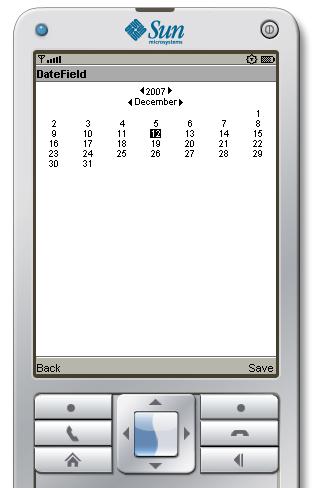
I explained earlier that in some cases, when the user attempts to interact with an Item, the system switches to a system-generated screen where the actual interaction takes place. This is true for a DateField object. At least it is true when the editing takes place using the Sun cell phone emulator.
As I mentioned earlier, Figure 3 shows the display of the DateField object when the date information has not been set. Figure 7 shows what happens when you navigate the focus to the DateField object and press the large square button on the cell phone emulator keypad.
Figure 7. System generated screen for editing the DateField object contents.
|
|
Setting and saving the date
Note first that a Save operation is associated with the top right soft key below the screen.
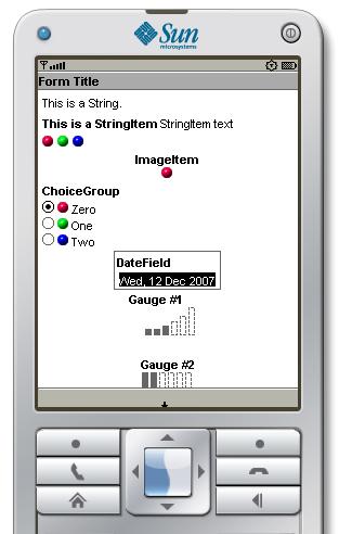
Once this display appears on the screen, you can use the arrow keys to move the highlight to a different year, a different month, and a specific day within the month. If you do this and then click the soft key to Save the results, the Form display changes to something similar to that shown in Figure 8.
Figure 8. Result of editing the contents of the DateField object.
|
|
As you can see in Figure 8, the new contents of the DateField object are rendered in text form in the visual representation of the DateField object. When you navigate the focus away from the DateField object, the text will return to a normal black on white format instead of being white in a black background as shown in Figure 8.
You learned quite a lot about the Gauge class in the earlier lesson titled Using Alerts, Images, Timers, and Gauges in MIDlets (see Resources). However, Gauge objects can be made interactive or non-interactive. In the earlier lesson, I purposely avoided discussing the interactive capability.
The Gauge object with the label Gauge #1 in Figure 3 is an interactive Gauge object. The code that produced this object and added it to the Form is shown in Listing 6.
Listing 6. Creating an interactive Gauge object and adding it to the Form.
    Gauge gauge01 = new Gauge("Gauge #1",true,6,3);
    form.append(gauge01);
|
Constructor for the Gauge class
There is only one constructor for the Gauge class and it requires the following parameters:
The only parameter that you didn't see illustrated in the earlier lesson is the second parameter that is highlighted in boldface. If this parameter value is true, the Gauge is interactive. If false, the Gauge is not interactive.
As you can see in Listing 6, this parameter was set to true for the Gauge with the label Gauge #1. The value of six for the maxValue parameter in Listing 6 causes the Gauge to have six bars in Figure 3. The value of three for the initialValue parameter in Listing 6 causes the leftmost three bars to be black in Figure 3.
What makes it interactive?
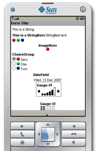
If you navigate the focus to Gauge #1, the visual manifestation of the interactive Gauge in the Sun cell phone emulator will change to look something like that shown in Figure 9. (Note the arrows on either side of the bar graph.)
Figure 9. Display of interactive Gauge object with the focus.
|
|
Interacting with the Gauge
When the interactive Gauge has the focus as shown in Figure 9, you can use the horizontal arrow keys on the cell phone emulator keypad to cause more or fewer of the bars in the bar chart to be colored black. Then you can call the getValue method on the Gauge object to determine how many bars were set to black by the user. You could use this approach, for example, to adjust the volume for audio output, or for any purpose that the user needs to manually provide very granular integer input data to the MIDlet.
Gauge #2
The Gauge object with the label Gauge #2 in Figure 3 is a non-interactive Gauge. You learned about non-interactive Gauge objects in the earlier lesson. You can view the code that was used to create this non-interactive Gauge and add it to the Form in Listing 10.
An object of the Spacer class provides a blank non-interactive Item for which the width and the height in pixels can be set by the program.
The ability to set the width makes a Spacer object useful for creating a programmable amount of space between objects on the same row. For example, I could have used Spacer objects to separate the red, green, and blue ball images on the third row in Figure 3.
The ability to set the height is useful for inserting space between rows. For example, a 10x10 Spacer was used to provide vertical separation between Gauge #1 and Gauge #2 in Figure 3.
A Spacer object's primary purpose is to position other items. Having a label on the Spacer would not be consistent with that purpose. Therefore, the label for a Spacer object is always null.
Constructor for a Spacer
The Spacer class has a single constructor with two required parameters. The first parameter sets the width in pixels and the second parameter sets the height in pixels. If either value is negative, an IllegalArgumentException will be thrown.
Methods for the Spacer class
The Spacer class defines four methods. Two of the methods have to do with commands and interactive programming, which will be the topic of a future lesson. The other two methods are:
Sun has this to say about the first method named setLabel:
"Spacers are restricted to having null labels, so this method will always throw IllegalStateException whenever it is called."
You might wonder why the class would define a method that simply throws an exception if called. The reason is probably because the setLabel method is inherited from the Item class. A label is not needed for a Spacer object, so the inherited method is overridden to disable it.
Create a Spacer and add it to the Form
Listing 7 shows the code that was used to create the Spacer and add it to the Form, producing the vertical separation between the two Gauge objects in Figure 3.
Listing 7. Create a Spacer and add it to the Form.
    Spacer spacer = new Spacer(10,10);
    form.append(spacer);
|
A TextField object is essentially a TextBox object embedded in a Form. You learned about TextBox objects in the earlier lesson titled Introduction to the MIDlet User Interface, Part 1 (see Resources). Aside from appending the TextField object to the Form, there is little, if anything about a TextField that is new to this lesson. Therefore, an explanation of the TextField class is not needed.
Scroll down and view the TextField object
A portion of Gauge #2 and the entire TextField object is off the bottom of the screen in Figure 3.
Figure 10 shows the result of scrolling the cell phone emulator screen down far enough to be able to see the entire Gauge #2 object and the TextField object. (Note the tiny arrow pointing up, indicating that part of the Form is not visible because it is off the top of the screen.)
Figure 10. Scroll down and view the TextField object.
|
|
The code that created the TextField
You can view the code used to produce the TextField object and add it to the Form in Listing 10 near the end of the lesson.
The MIDlet named Form01
The purpose of this MIDlet is to illustrate the creation and use of a Form. The MIDlet creates a Form and populates it with the following Item objects:
The height of the Form is greater than the height of the Sun cell phone emulator screen. Therefore it is necessary to scroll down to see the TextField and the bottom portion of the non-interactive Gauge as shown in Figure 10.
The MIDlet displays the form and allows the user 100 seconds to experiment with the Form. Then it enters the destroyed state.
The MIDlet was tested using a Java SE 6 compiler, targeted at a V1.4virtual machine, and WTK 2.5.2 running under Windows XP.
Will discuss in fragments
A complete listing of this MIDlet is provided in Listing 10. Most of the code in the MIDlet was explained in the earlier section. I will discuss the remaining code in fragments.
Beginning of the class named Form01
Listing 8 shows the beginning of the class down through the end of the constructor. The code that I explained earlier has been deleted from Listing 8 for brevity.
Listing 8. Beginning of the class named Form01.
public class Form01 extends MIDlet{
  Image redBallImage;
  Image greenBallImage;
  Image blueBallImage;
  Form form;
  //----------------------------------------------------//

  public Form01(){//constructor
    System.out.println("Construct MIDlet");

    try{
      System.out.println("Construct Image objects");
      //Make certain that the image files specified
      // below are in the same directory as the source
      // file.
      redBallImage = Image.createImage(
                                   "/Form01/redball.PNG");
      greenBallImage = Image.createImage(
                                 "/Form01/greenball.PNG");
      blueBallImage = Image.createImage(
                                  "/Form01/blueball.PNG");
    }catch(Exception e){
      e.printStackTrace();
    }//end catch

    //...Code deleted for brevity...

  }//end constructor
|
Instance variables
|
The class begins by declaring several instance variables, including three variables of type Image that will be used to represent the red, green, and blue ball images shown in Figure 3. To run this MIDlet, you will need to put three small image files in the same directory as the source code. You can either give the files the following names, or you can modify the code in Listing 8 to match the names of your image files:
The constructor
The only code in the constructor that I didn't explain earlier is the code required to create the three objects of type Image. This code is straightforward and should not require further explanation.
The remaining code in the class
Listing 9 shows the startApp, pauseApp, and destroyApp methods in their entirety.
Listing 9. The remaining code in the class named Form01.
  public void startApp(){

    //Make the Form the current display.
    System.out.println("Display form");
    Display.getDisplay(this).setCurrent(form);

    //Sleep for 100 seconds.
    try{Thread.currentThread().sleep(100000);
    } catch(Exception e){}

    //Enter the destroyed state.
    this.destroyApp(true);
  }//end startApp
  //----------------------------------------------------//

  public void pauseApp(){
  }//end pauseApp
  //----------------------------------------------------//

  public void destroyApp(boolean unconditional){
    System.out.println("Destroy MIDlet");
    notifyDestroyed();
  }//end destroyApp
  //----------------------------------------------------//

}//end class Form01
|
Assuming that you have been studying the earlier lessons in this series, you should find the code in Listing 9 to be straightforward with no further explanation required.
The end of the MIDlet program
Listing 9 also signals the end of the Form01 class and the end of the MIDlet program.
I encourage you to copy the MIDlet code from Listing 10. Run the MIDlet in the updated MIDlet development framework named WTKFramework03 that I provided in the lesson titled Using Alerts, Images, Timers, and Gauges in MIDlets (see Resources).
Experiment with the MIDlet code, making changes and running your modified MIDlets in the framework program. See if you can explain the effects of your changes.
Don't forget that you will need to download and install the latest version of the Sun Java Wireless Toolkit for CLDC (see Resources). As of the date this lesson is being written, the latest version of the toolkit is WTK2.5.2.
In addition you will need three small image files to replace the red, green, and blue ball images in Figure 3.
In this lesson, you learned about the class named Item. Then you learned how to create a Form and how to populate it with objects of the following classes:
You also learned something about layout directives and appearance modes.
In the next lesson, you will learn how to add commands to a MIDlet and how those commands are presented to the user in the Sun cell phone emulator. You will also learn how to produce interactive behavior in a MIDlet through the use of a CommandListener object and an ItemCommandListener object.
Listing 10. Source code for the MIDlet named Form01.
/*Form01.java
Copyright 2007, R.G.Baldwin

The purpose of this MIDlet is to illustrate the creation
and use of a Form.

The MIDlet creates a Form and populates it with the
following Item objects:

A simple String using a shorthand method for StringItem.

A StringItem. The appearance is set to BUTTON but that
doesn't seem to have any effect on the visual appearance
in the Sun cell phone emulator.

Three images using a shorthand method for ImageItem.

An ImageItem. The appearance is set to BUTTON and
alternate text is provided. However, this doesn't seem to
have any effect in the Sun cell phone emulator.

A ChoiceGroup containing three elements each of which has
an image and a text part. The ChoiceGroup is essentially
a List embedded in a Form and it is configured as
EXCLUSIVE.

A DateField configured to contain only a date as opposed
to containing both a date and a time.

An interactive Gauge.

A Spacer.

A non-interactive Gauge.

A TextField configured to allow for the entry of ANY text.

The height of the Form is greater than the height of the
Sun cell phone emulator screen.  Therefore it is necessary
to scroll down to see the TextField and the bottom
portion of the non-interactive Gauge.

The MIDlet displays the form and allows the user 100
seconds to experiment with the Form.  Then it enters the
destroyed state.

Tested using a Java SE 6 compiler, targeted at a V1.4
virtual machine, and WTK 2.5.2 running under Windows XP.
*********************************************************/

package Form01;

import javax.microedition.lcdui.Display;
import javax.microedition.lcdui.Form;
import javax.microedition.midlet.MIDlet;
import javax.microedition.lcdui.Item;
import javax.microedition.lcdui.Image;
import javax.microedition.lcdui.ImageItem;
import javax.microedition.lcdui.Choice;
import javax.microedition.lcdui.ChoiceGroup;
import javax.microedition.lcdui.DateField;
import javax.microedition.lcdui.Gauge;
import javax.microedition.lcdui.Spacer;
import javax.microedition.lcdui.StringItem;
import javax.microedition.lcdui.TextField;

public class Form01 extends MIDlet{
  Image redBallImage;
  Image greenBallImage;
  Image blueBallImage;
  Form form;
  //----------------------------------------------------//

  public Form01(){//constructor
    System.out.println("Construct MIDlet");

    try{
      System.out.println("Construct Image objects");
      //Make certain that the image files specified
      // below are in the same directory as the source
      // file.
      redBallImage = Image.createImage(
                                   "/Form01/redball.PNG");
      greenBallImage = Image.createImage(
                                 "/Form01/greenball.PNG");
      blueBallImage = Image.createImage(
                                  "/Form01/blueball.PNG");
    }catch(Exception e){
      e.printStackTrace();
    }//end catch

    System.out.println("Create Form");
    form = new Form("Form Title");

    //Append a String to the form.  This is a shorthand
    // for StringItem
    form.append("This is a String.\n");

    //Append a StringItem to the form.  Note that the use
    // of the BUTTON appearance doesn't seem to have any
    // effect.  Also note the use of the newline character
    // to force the next Item to be displayed on a new
    // row in the Sun cell phone emulator.
    StringItem stringItem = new StringItem(
                                   "This is a StringItem",
                                   "StringItem text\n",
                                   Item.BUTTON);
    form.append(stringItem);

    //Put three images in the form.  This is a shorthand
    // for ImageItem. All three images end up in the same
    // row in the Sun cell phone emulator.
    form.append(redBallImage);
    form.append(greenBallImage);
    form.append(blueBallImage);

    //Create and append an ImageItem.  Note that the
    // BUTTON appearance designation doesn't seem to have
    // any effect. The same is true of the Alt Text.
    ImageItem imageItem = new ImageItem(
                                     "ImageItem",
                                     redBallImage,
                                     Item.LAYOUT_CENTER,
                                     "Alt Text",
                                     Item.BUTTON);
    form.append(imageItem);

    //Create a ChoiceGroup and append it to the Form. Set
    // the alignment to the default layout for this type
    // of Item. This is like an embedded List. Set the
    // selection mode to EXCLUSIVE.
    ChoiceGroup choiceGroup = new ChoiceGroup(
                                        "ChoiceGroup",
                                        Choice.EXCLUSIVE);
    choiceGroup.append("Zero",redBallImage);
    choiceGroup.append("One",greenBallImage);
    choiceGroup.append("Two",blueBallImage);
    choiceGroup.setLayout(Item.LAYOUT_DEFAULT);
    form.append(choiceGroup);

    //Create a new DateField and append it to the form.
    DateField dateField = new DateField("DateField",
                                        DateField.DATE);
    form.append(dateField);

    //Create two Gauges separated by a Spacer. The first
    // Gauge is interactive.  The second is not
    // interactive.
    Gauge gauge01 = new Gauge("Gauge #1",true,6,3);
    form.append(gauge01);

    Spacer spacer = new Spacer(10,10);
    form.append(spacer);

    Gauge gauge02 = new Gauge("Gauge #2",false,6,2);
    form.append(gauge02);

    //Create a TextField and append it to the form. This
    // item is below the bottom of the screen. Scrolling
    // is required to expose this item. It will accept
    // ANY input character. This is similar to a TextBox
    // embedded in a Form.
    TextField textField = new TextField("TextField",
                                        "Initial Text",
                                        30,
                                        TextField.ANY);
    form.append(textField);
  }//end constructor
  //----------------------------------------------------//

  public void startApp(){

    //Make the Form the current display.
    System.out.println("Display form");
    Display.getDisplay(this).setCurrent(form);

    //Sleep for 100 seconds.
    try{Thread.currentThread().sleep(100000);
    } catch(Exception e){}

    //Enter the destroyed state.
    this.destroyApp(true);
  }//end startApp
  //----------------------------------------------------//

  public void pauseApp(){
  }//end pauseApp
  //----------------------------------------------------//

  public void destroyApp(boolean unconditional){
    System.out.println("Destroy MIDlet");
    notifyDestroyed();
  }//end destroyApp
  //----------------------------------------------------//

}//end class Form01
|
Copyright 2008, Richard G. Baldwin. Reproduction in whole or in part in any form or medium without express written permission from Richard Baldwin is prohibited.
Richard has participated in numerous consulting projects and he frequently provides onsite training at the high-tech companies located in and around Austin, Texas. He is the author of Baldwin's Programming Tutorials, which have gained a worldwide following among experienced and aspiring programmers. He has also published articles in JavaPro magazine.
In addition to his programming expertise, Richard has many years of practical experience in Digital Signal Processing (DSP). His first job after he earned his Bachelor's degree was doing DSP in the Seismic Research Department of Texas Instruments. (TI is still a world leader in DSP.) In the following years, he applied his programming and DSP expertise to other interesting areas including sonar and underwater acoustics.
Richard holds an MSEE degree from Southern Methodist University and has many years of experience in the application of computer technology to real-world problems.
Keywords
java J2ME MIDlet "cell phone emulator" "wireless toolkit" WTK MIDP CLDC
Displayable TextBox Ticker TextField Alerts Images Timers Gauges Lists Forms
Items String StringItem ImageItem ChoiceGroup DateField
-end-