

| << Chapter < Page | Chapter >> Page > |
U.S. income distribution by quintile appears in [link] . In 2011, for example, the bottom quintile of the income distribution received 3.2% of income; the second quintile received 8.4%; the third quintile, 14.3%; the fourth quintile, 23.0%; and the top quintile, 51.14%. The final column of [link] shows what share of income went to households in the top 5% of the income distribution: 22.3% in 2011. Over time, from the late 1960s to the early 1980s, the top fifth of the income distribution typically received between about 43% to 44% of all income. The share of income that the top fifth received then begins to rise. According to the Census Bureau, much of this increase in the share of income going to the top fifth can be traced to an increase in the share of income going to the top 5%. The quintile measure shows how income inequality has increased in recent decades.
| Year | Lowest Quintile | Second Quintile | Third Quintile | Fourth Quintile | Highest Quintile | Top 5% |
|---|---|---|---|---|---|---|
| 1967 | 4.0 | 10.8 | 17.3 | 24.2 | 43.6 | 17.2 |
| 1970 | 4.1 | 10.8 | 17.4 | 24.5 | 43.3 | 16.6 |
| 1975 | 4.3 | 10.4 | 17.0 | 24.7 | 43.6 | 16.5 |
| 1980 | 4.2 | 10.2 | 16.8 | 24.7 | 44.1 | 16.5 |
| 1985 | 3.9 | 9.8 | 16.2 | 24.4 | 45.6 | 17.6 |
| 1990 | 3.8 | 9.6 | 15.9 | 24.0 | 46.6 | 18.5 |
| 1995 | 3.7 | 9.1 | 15.2 | 23.3 | 48.7 | 21.0 |
| 2000 | 3.6 | 8.9 | 14.8 | 23.0 | 49.8 | 22.1 |
| 2005 | 3.4 | 8.6 | 14.6 | 23.0 | 50.4 | 22.2 |
| 2010 | 3.3 | 8.5 | 14.6 | 23.4 | 50.3 | 21.3 |
| 2013 | 3.2 | 8.4 | 14.4 | 23.0 | 51 | 22.2 |
It can also be useful to divide the income distribution in ways other than quintiles; for example, into tenths or even into percentiles (that is, hundredths). A more detailed breakdown can provide additional insights. For example, the last column of [link] shows the income received by the top 5% percent of the income distribution. Between 1980 and 2013, the share of income going to the top 5% increased by 5.7 percentage points (from 16.5% in 1980 to 22.2% in 2013). From 1980 to 2013 the share of income going to the top quintile increased by 7.0 percentage points (from 44.1% in 1980 to 51% in 2013). Thus, the top 20% of householders (the fifth quintile) received over half (51%) of all the income in the United States in 2013.
The data on income inequality can be presented in various ways. For example, you could draw a bar graph that showed the share of income going to each fifth of the income distribution. [link] presents an alternative way of showing inequality data in what is called a Lorenz curve . The Lorenz curve shows the cumulative share of population on the horizontal axis and the cumulative percentage of total income received on the vertical axis.
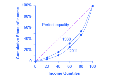
Every Lorenz curve diagram begins with a line sloping up at a 45-degree angle, shown as a dashed line in [link] . The points along this line show what perfect equality of the income distribution looks like. It would mean, for example, that the bottom 20% of the income distribution receives 20% of the total income, the bottom 40% gets 40% of total income, and so on. The other lines reflect actual U.S. data on inequality for 1980 and 2011.
Notification Switch
Would you like to follow the 'Microeconomics' conversation and receive update notifications?

|
|
|
|
|

|
|

|
|

|
|

|
|
|
|
|

|
|
|
|

|
|

|
|

|