

| << Chapter < Page | Chapter >> Page > |

Rules can be broken with the addition of appropriate metadata, and this has been known for a long time. The addition of good metadata including all forms of annotations is very important even if it takes time and careful thought. Metadata can include all details describing the source of the data, the methods used to pre-manipulate the data and create the visualization, as well as the contact details of the author, creation date etc. Recently there have been tools developed to help record this process. These include the development of software within e-Science, creating a set of middleware linking computing resources together – adding semantic tags which define meaning to these components – and creating ontologies, which describe how human terms relate to computer terms.
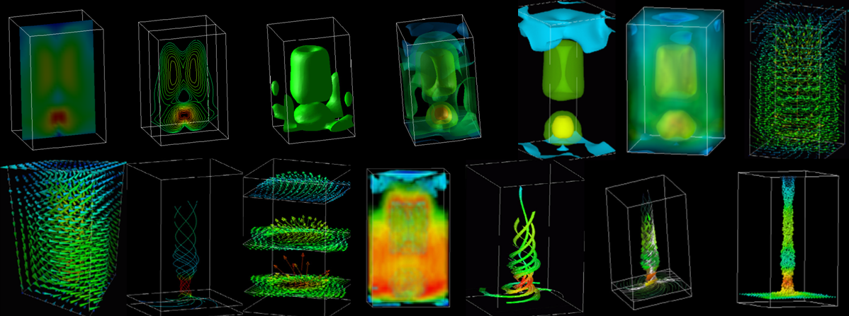
A proposal is to add paradata that extends the concept of metadata to consider issues of choice and alternatives by recording the subjective decisions. For example, Figure 5 shows fourteen different visualization variations for a simple vortex fluid flow data set. Often only one or two images will be used to illustrate a specific scientific phenomenon, but it is very rarely considered in detail what decisions have been make and it is even rarer for these decisions to be written down, as to why a particular version has been chosen. The use of paradata would now allow and even force the authors to describe the reasons for their choices.
It is said that an image is worth a thousand words, but we can rephrase this to say a good visualization may need a thousand words of annotations, in both metadata and paradata, in order to properly describe it.
A couple of solutions to address visualization are the introduction of recordable and shareable workflows ( myExperiment ), and the controlled recording of researchers' choices creating a visualization provenance ( VisTrails ). These and similar tools are going to be more available within VREs ( Virtual Research Environments ) that are already considering the use of collaborative environments; including an emphasis on the web 2.0 generic principles of being able to store and annotate everything.
They always say you can lie with statistics, but similarly you can lie with visualizations as well. This is especially true as visualizations not only can be selective in choice of data, but as they employ the human visual system they can create visual illusions as well. Often this process is not deliberate but is accidentally misleading, caused by authors who only have space for a few visualizations and make quick, possibly uninformed, decisions.
We have presented a few very simple examples to describe how small changes can improve the presentation of information. Also we have given a warning that without defining and describing the choices made, through metadata and possibly paradata, there can be confusion. Fortunately there are now methods, just starting to be introduced, to help in the process, although more need to be actively used, tested and developed.
At the University of Manchester, Research Computing Services, starting with the Computer Graphics Unit, has for over 30 years been considering how to efficiently create and present visual stimuli and is still learning the best way to integrate and transfer information from computer source to the human user. Thanks to all those who indirectly have contributed ideas to this short article from numerous sources (including the MSc module taught at Manchester ). It is recommended that readers explore the topic further as this barely covered the topic. Dr Martin J. Turner, the University of Manchester, and part of the JISC funded national vizNET support network, Martin.Turner@manchester.ac.uk.
Schroeder, W., Martin, K. and Lorensen, B. (1998) The Visualization Toolkit Prentice Hall 1998 2nd Edition
Tukey, J. W. (1977) Exploratory Data Analysis. Addison-Wesley, Reading, MA
Tufte, E.R. (2001) The Visual Display of Quantitative Information Graphics Press, Cheshire, Connecticut 2nd Edition
Tufte, E.R. (1997) Visual Explanations: Images and Quantities, Evidence and Narrative Graphics Press Cheshire, Connecticut
Notification Switch
Would you like to follow the 'Research in a connected world' conversation and receive update notifications?

|
|

|
|

|
|
|
|
|
|
|
|

|
|

|
|
|
|
|
|
|
|

|