

| << Chapter < Page | Chapter >> Page > |
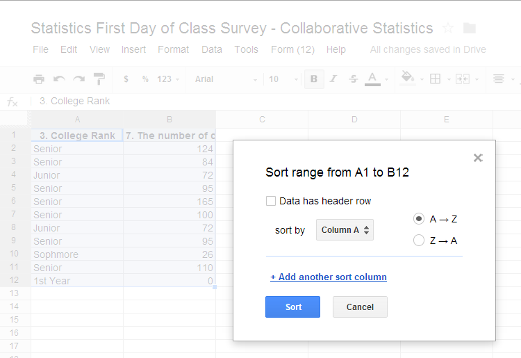
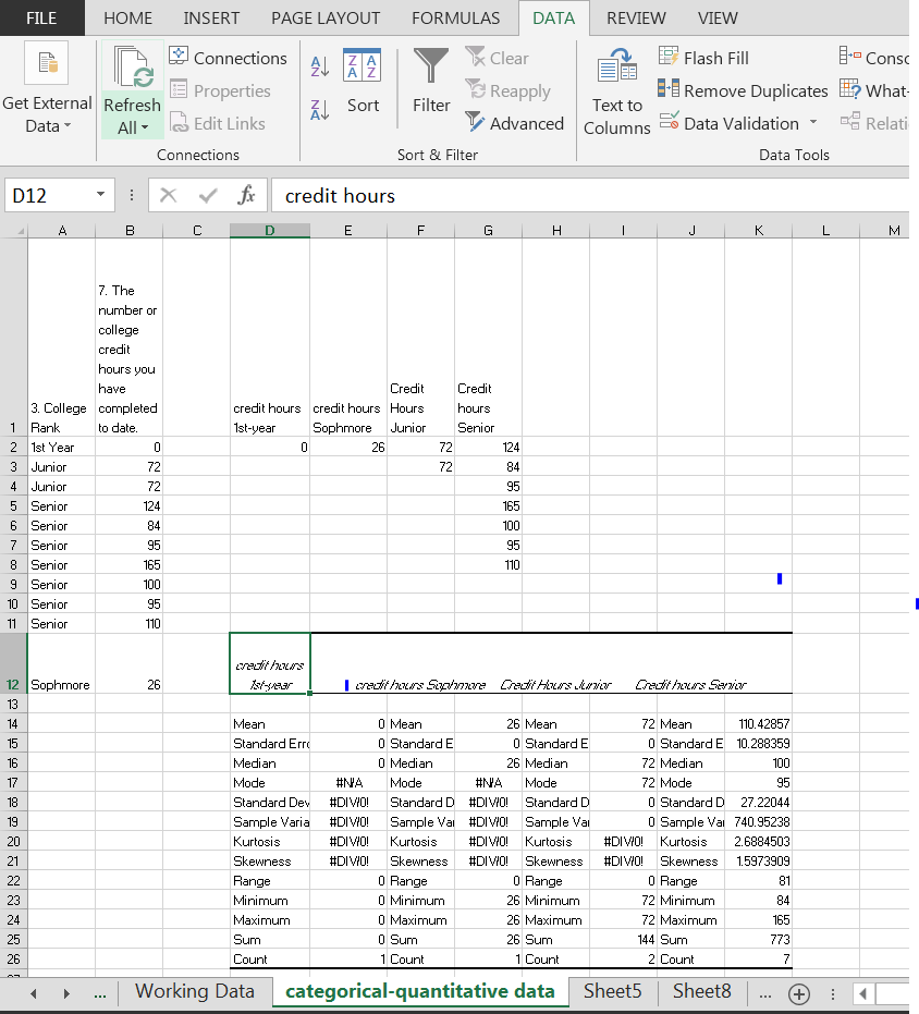
Sorting Data: To sort data in Excel or Google Spreadsheet, you will go to the “DATA” tab and select “sort data” you want to sort by your categorical data based on the alphabet. Once you have sorted the data the order will change. Once you have the new order of your data you will need to copy in a separate column each of the numeric data for each unique categorical data source. See the example below. I have labeled each column by the category and have copied only the numeric data related to the category in the rows below the title of the column. Note that I used “wrap text” to keep my titles compact and I copied my data into the appropriate columns based on my titles. This is the same process in Excel and in Google Spreadsheet.

Descriptive Statistics: Once you have created your columns of sorted data you can select all of the columns and create your summary descriptive statistics using the Data Analysis Tool in Excel or by using formula to create you summary statistics in Excel or Google Spreadsheet.

Side by Side Histogram will need to be created individually as we did in Univariate Descriptive Statistics using the individual columns of data and then copy and pasting them side by side using either Excel or Google Spreadsheets.
Side by Side Box Plots will also need to be create individually in Excel as we did in Univariate Descriptive Statistics however you will use the template especially created for multiple side by side box plots.
Side by Side Stem and Leaf graphs also will use the same methods as we used in Univariate Descriptive Statistics.
At your computer, try this exercise: (1) Open the file, Statistics First Day of Class Survey that you worked on previously (2) open the file in Google Spreadsheet or Excel; (3) create a new worksheet tab and label it Bivariate Graphs for Categorical-Numeric Data; (4) pick two columns of data one that is categorical and one that is numerical and has been “cleaned” and sort your data by categories; (5) create your columns of sorted data with all the appropriate labels; (6) create your descriptive statistics for each of your categories of data; (7) create either side by side histograms, box plots, or stem and leaf graphs based on the descriptive statistics indication of shape, center, and spread; finally, (8) save the file again and post in the appropriate Moodle assignment.
When we have numerical-numerical data we can use the descriptive statistics that we had created previously, since we are not re-grouping the data. We will want to look at the relationship between the two numerical sets of data and to do that we will create a scatter plot, create a line of best fit, create the equation for the line of best fit and inspect the R and R 2 values.
Scatterplots in Excel and Google Spreadsheet are very much the same. You will select your two column of data of interest, copy and paste them to a new spreadsheet and label the spreadsheet. Once that is complete you will highlight the two columns of data and go to the “INSERT” tab and “insert scatter or bubble chart.” The following popup window will appear after you click.

You will now need to choose the graph and click “OK” to insert the graph into your page (in Excel) or Insert (in Google spreadsheet. You will then need to create labels for the axis. Once you click on “OK” or “Insert” this following screen will appear and if you mouse over and click on your scatterplot you will see the plus, paintbrush, and funnel appear to the right of the graph. Those tools will allow you to edit your scatterplot to make it look professional.


In Excel: Now choose the plus to edit your chart title, create your axis labels, and trendline. When you mouse over “trendline” a right facing arrow will appear. Click on that arrow and you will see a new pull down menu with the option to select, “more options. . . ” Select that option and you will see another popup menu with the choice to select a Linear trendline, and then at the bottom of that trendline options list you will find option boxes for “Display Equation on chart”, and Display R-squared value on chart. Put a check mark in both of these boxes and you are ready to describe the relationship between the two variables.

In Google Spreadsheet: Click on the down arrow in the upper right hand corner and select advanced edit. You can there customize your chart adding a title and axis labels. You will not however be able to add the trendline or the equation easily. Excel is more advanced for this feature. You could also turn off legend since it is not necessary for this type of graph. It has a drop down menu with the option of none.

At your computer, try this exercise: (1) Open the file, Statistics First Day of Class Survey that you worked on previously (2) open the file in Google Spreadsheet or Excel; (3) create a new worksheet tab and label it Bivariate Graphs for Numeric-Numeric Data; (4) pick two columns of data (both numerical) and data has been “cleaned”; (5) create you’re a scatterplot with all the appropriate labels; (6) create line of best fit with R 2 ; (7) create a paragraph describing the relationship between the variables; finally, (8) copy and paste your scatterplot to a word document with your narrative description, save the file and post in the appropriate Moodle assignment.
Notification Switch
Would you like to follow the 'Collaborative statistics using spreadsheets' conversation and receive update notifications?

|
|

|
|

|
|

|
|

|
|

|
|

|
|

|
|

|
|

|