

| << Chapter < Page | Chapter >> Page > |
Definition:
Properties:

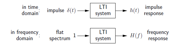
An infinitely tall and thin waveform with unit area :
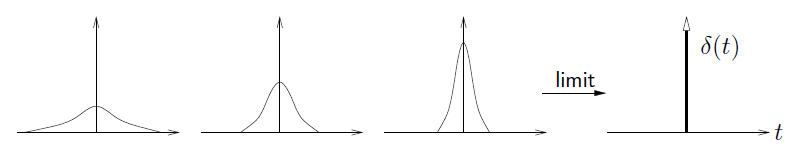
that's often used to “kick” a system and see how it responds.
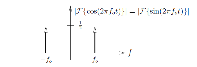
Notice from the sifting property that
Thus, Euler's equations
and the Fourier transform pair imply that
Often we draw this as
Fourier transform requires evaluation of an integral. What do we do if we can't define/solve the integral?
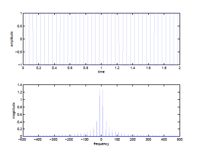
plottf.m (from course webpage).f = 10;
t_max = 2;Ts = 1/1000;
t = 0:Ts:t_max;x = sign(cos(2*pi*f*t));
plottf(x,Ts);
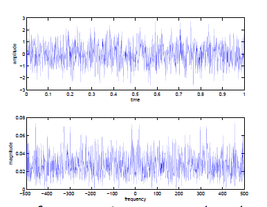
t_max = 1;
Ts = 1/1000;x = randn(1,t_max/Ts);
plottf(x,Ts);
Notice that
plottf.m only plots frequencies
.
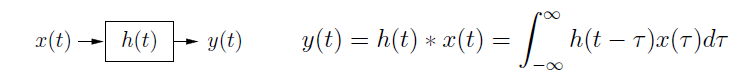
An LTI system can be described by either its “impulse response” or its “frequency response” .

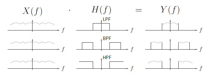
Freq-domain illustration of LPF, BPF, and HPF:
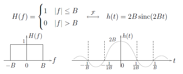
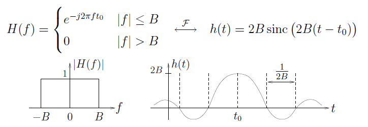
Ideal non-causal LPF (using ):
Ideal LPF with group-delay t o :
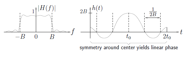
A causal linear-phase LPF with group-delay t o :
but MATLAB can give better causal linear-phase LPFs...
In MATLAB, generate -sampled LPF impulse response via
h = firls(Lf, [0,fp,fs,1], [G,G,0,0])/Ts;
where...
![This figure contains one graph and a series of labels. The graph plots two horizontal lines. The first is shorter, at vertical value G. It ends at horizontal value fp. The second is longer, at vertical value 0. It begins at horizontal value fs and ends at horizontal value 1. The horizontal axis is labeled f/[/(2T_S)]. To the right of this graph are three expressions. The first reads Lf + 1 = impulse response length. The second reads {0, fp}, {fs, 1} = normalized freq pairs. The third reads {G, G}, {0, 0} = corresp. magnitude pairs.](/ocw/mirror/col10968_1.2_complete/m31815/fig17.png)
The commands
firpm and
fir2 have the same interface,
but yield slightly different results (often worse for our apps).
In MATLAB, perform filtering on
-sampled signal
x via
y = Ts*filter(h,1,x); or
y = Ts*conv(h,x);
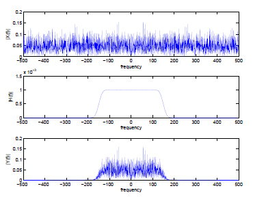
t_max = 3; Ts = 1/1000;
x = randn(1,t_max/Ts);h = firls(100,[0,0.2,0.4,1],[1,1,0,0])/Ts;
y = Ts*filter(h,1,x);subplot(3,1,1);
plottf(x,Ts,’f’);ylabel(’|X(f)|’)
subplot(3,1,2);plottf(h,Ts,’f’);
ylabel(’|H(f)|’)subplot(3,1,3);
plottf(y,Ts,’f’);ylabel(’|Y(f)|’)
firls,firpm,fir2 generate
causal linear-phase filters with group delay
samples.
Thus, the filtered output
y will be delayed by
samples relative to
x .Notification Switch
Would you like to follow the 'Introduction to analog and digital communications' conversation and receive update notifications?

|
|

|
|

|
|

|
|

|
|

|
|

|
|

|
|
|
|
|

|