

| << Chapter < Page | Chapter >> Page > |
Unlike histograms, many frequency polygons can be plotted together to compare several frequency distributions, provided that the data has been grouped in the same way and provide a clear way to compare multiple datasets.
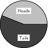
A pie chart is a graph that is used to show what categories make up a specific section of the data, and what the contribution each category makes to the entire set of data. A pie chart is based on a circle, and each category is represented as a wedge of the circle or alternatively as a slice of the pie. The area of each wedge is proportional to the ratio of that specific category to the total number of data values in the data set. The wedges are usually shown in different colours to make the distinction between the different categories easier.
Method: Drawing a pie-chart
Draw a pie chart for Data Set 2 , showing the relative proportions of each data value to the total.
| Total | |||||||
| Data Value | 1 | 2 | 3 | 4 | 5 | 6 | – |
| Frequency | 30 | 32 | 35 | 34 | 37 | 32 | 200 |
| Data Value | Angular Size of Wedge |
| 1 | |
| 2 | |
| 3 | |
| 4 | |
| 5 | |
| 6 |

Note that the total angular size of the wedges may not add up to exactly 360 because of rounding.
All graphs that have been studied until this point (bar, compound bar, histogram, frequency polygon and pie) are drawn from grouped data. The graphs that will be studied in this section are drawn from the ungrouped or raw data.
Line and broken line graphs are plots of a dependent variable as a function of an independent variable, e.g. the average global temperature as a function of time, or the average rainfall in a country as a function of season.
Usually a line graph is plotted after a table has been provided showing the relationship between the two variables in the form of pairs. Just as in (x,y) graphs, each of the pairs results in a specific point on the graph, and being a line graph these points are connected to one another by a line.
Many other line graphs exist; they all connect the points by lines, not necessarily straight lines. Sometimes polynomials, for example, are used to describe approximately the basic relationship between the given pairs of variables, and between these points.

Clawde the cat is overweight and her owners have decided to put her on a restricted eating plan. Her mass is measured once a month and is tabulated below. Draw a line graph of the data to determine whether the restricted eating plan is working.
| Month | Mass (kg) |
| March | 4,53 |
| April | 4,56 |
| May | 4,51 |
| June | 4,41 |
| July | 4,41 |
| August | 4,36 |
| September | 4,43 |
| October | 4,37 |
We are required to plot a line graph to determine whether the restricted eating plan is helping Clawde the cat lose weight. We are given all the information that we need to plot the graph.

There is a slight decrease of mass from March to October, so the restricted eating plan is working, but very slowly.
| Walk | 15 |
| Cycle | 24 |
| Train | 18 |
| Bus | 8 |
| Car | 35 |
| Total | 100 |
| Time | 07h00 | 08h00 | 09h00 | 10h00 | 11h00 | 12h00 |
| Temp ( C) | 16 | 16,5 | 17 | 19 | 20 | 24 |
| Time in seconds | Frequency |
| 16 - 25 | 5 |
| 26 - 35 | 10 |
| 36 - 45 | 26 |
| 46 - 55 | 30 |
| 56 - 65 | 15 |
| 66 - 75 | 12 |
| 76 - 85 | 10 |
| 82 | 75 | 66 | 54 | 79 | 78 | 29 | 55 | 68 | 91 |
| 43 | 48 | 90 | 61 | 45 | 60 | 82 | 63 | 72 | 53 |
| 51 | 32 | 62 | 42 | 49 | 62 | 81 | 49 | 61 | 60 |
| Year | 2003 | 2004 | 2005 | 2006 | 2007 |
| Girls | 18 | 15 | 13 | 12 | 15 |
| Boys | 15 | 11 | 18 | 16 | 10 |
Notification Switch
Would you like to follow the 'Siyavula textbooks: grade 10 maths [ncs]' conversation and receive update notifications?

|
|

|
|

|
|

|
|

|
|

|
|

|
|

|
|

|
|

|