

| << Chapter < Page | Chapter >> Page > |
Find out more about Geller and Huchra’s work (including interviews with Geller) in this 4-minute NOVA video. You can also learn more about their conclusions and additional research it led to.
The largest universe mapping project to date is the Sloan Digital Sky Survey (see the Making Connections feature box Astronomy and Technology: The Sloan Digital Sky Survey at the end of this section). A plot of the distribution of galaxies mapped by the Sloan survey is shown in [link] . To the surprise of astronomers, maps like the one in the figure showed that clusters of galaxies are not arranged uniformly throughout the universe, but are found in huge filamentary superclusters that look like great arcs of inkblots splattered across a page. The superclusters resemble an irregularly torn sheet of paper or a pancake in shape—they can extend for hundreds of millions of light-years in two dimensions, but are only 10 to 20 million light-years thick in the third dimension. Detailed study of some of these structures shows that their masses are a few times 10 16 M Sun , which is 10,000 times more massive than the Milky Way Galaxy.
Check out this animated visualization of large-scale structure from the Sloan survey.
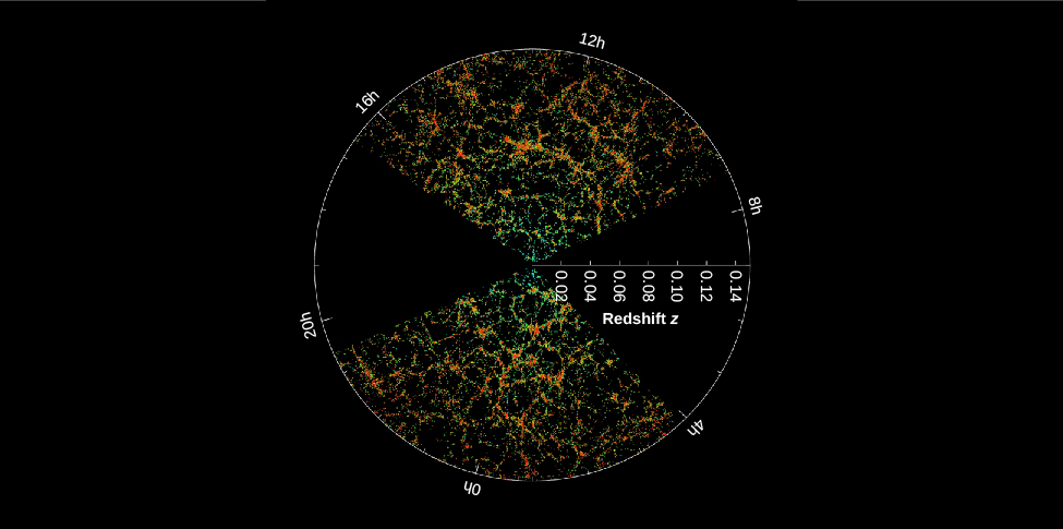
Separating the filaments and sheets in a supercluster are voids , which look like huge empty bubbles walled in by the great arcs of galaxies. They have typical diameters of 150 million light-years, with the clusters of galaxies concentrated along their walls. The whole arrangement of filaments and voids reminds us of a sponge, the inside of a honeycomb, or a hunk of Swiss cheese with very large holes. If you take a good slice or cross-section through any of these, you will see something that looks roughly like [link] .
Before these voids were discovered, most astronomers would probably have predicted that the regions between giant clusters of galaxies were filled with many small groups of galaxies, or even with isolated individual galaxies. Careful searches within these voids have found few galaxies of any kind. Apparently, 90 percent of the galaxies occupy less than 10 percent of the volume of space.
Notification Switch
Would you like to follow the 'Astronomy' conversation and receive update notifications?

|
|

|
|

|
|

|
|

|
|

|
|

|
|
|
|
|

|
|

|