<< Chapter < Page Chapter >> Page >

Learning objectives

By the end of this section, you will be able to:

  • Explain how the H–R diagram    of a star cluster can be related to the cluster’s age and the stages of evolution of its stellar members
  • Describe how the main-sequence turnoff of a cluster reveals its age

In the previous section, we indicated that that open clusters are younger than globular clusters, and associations are typically even younger. In this section, we will show how we determine the ages of these star clusters. The key observation is that the stars in these different types of clusters are found in different places in the H–R diagram, and we can use their locations in the diagram in combination with theoretical calculations to estimate how long they have lived.

H–r diagrams of young clusters

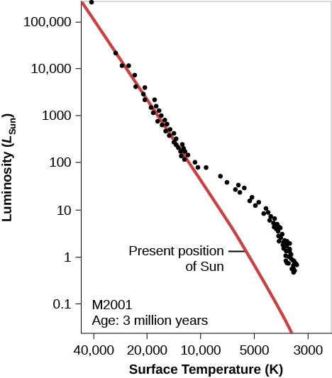
What does theory predict for the H–R diagram of a cluster whose stars have recently condensed from an interstellar cloud? Remember that at every stage of evolution, massive stars evolve more quickly than their lower-mass counterparts. After a few million years (“recently” for astronomers), the most massive stars should have completed their contraction phase and be on the main sequence, while the less massive ones should be off to the right, still on their way to the main sequence. These ideas are illustrated in [link] , which shows the H–R diagram calculated by R. Kippenhahn and his associates at Munich University for a hypothetical cluster with an age of 3 million years.

Young cluster h–r diagram.

Hypothetical H-R Diagram of a Young Cluster. In this plot titled “M 2001 Age: 3 million years,” the vertical axis is labeled “Luminosity (LSun),” and goes from 0.1 at the bottom to 100,000 at the top. The horizontal axis is labeled “Surface Temperature (K)”, and goes from 40,000 on the left to 3,000 on the right. The zero-age main sequence is drawn as a red diagonal line starting just above 100,000 LSun at the top of the graph down to about 4000 K at the bottom. The “Present position of Sun” is indicated at 5500 K and 1 LSun. Over-plotted on the graph are black dots representing the individual stars in the cluster. About half of the dots lie neatly along the red line until about 10000 K and 100 LSun. At this point, the remainder of the dots lie above the red line, meaning these stars have yet to reach the main sequence.
We see an H–R diagram for a hypothetical young cluster with an age of 3 million years. Note that the high-mass (high-luminosity) stars have already arrived at the main-sequence stage of their lives, while the lower-mass (lower-luminosity) stars are still contracting toward the zero-age main sequence (the red line) and are not yet hot enough to derive all of their energy from the fusion of hydrogen.

There are real star clusters that fit this description. The first to be studied (in about 1950) was NGC 2264, which is still associated with the region of gas and dust from which it was born ( [link] ).

Young cluster ngc 2264.

Image of the Young Cluster N G C 2264. This youthful cluster derives its name from the shape outlined by its brightest stars. The “Christmas Tree” is upside down in this image. The brightest star at the top of the frame is the base of the tree. The top of the tree is the star above the dark v-shaped lane in the nebula just left of the center at the bottom of the image.
Located about 2600 light-years from us, this region of newly formed stars, known as the Christmas Tree Cluster, is a complex mixture of hydrogen gas (which is ionized by hot embedded stars and shown in red), dark obscuring dust lanes, and brilliant young stars. The image shows a scene about 30 light-years across. (credit: ESO)

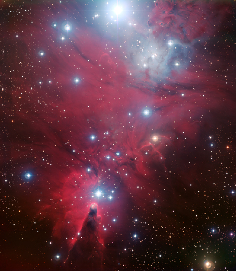
The NGC 2264 cluster’s H–R diagram is shown in [link] . The cluster in the middle of the Orion Nebula (shown in [link] and [link] ) is in a similar stage of evolution.

Ngc 2264 h–r diagram.

In this plot the vertical axis is labeled “Luminosity (LSun)” and goes from 0.1 at the bottom to 100,000 at the top. The horizontal axis is labeled “Surface Temperature (K)” and goes from 40,000 on the left to 3,000 on the right. The zero-age main sequence is drawn as a red diagonal line starting just above 100,000 LSun at the top of the graph down to about 4000 K at the bottom. Over plotted are the observed values of stars in N G C 2264, shown as black dots. Stars lie on the line until about 10000 K and 10 LSun, below which the stars reside above the main sequence.
Compare this H–R diagram to that in [link] ; although the points scatter a bit more here, the theoretical and observational diagrams are remarkably, and satisfyingly, similar.

As clusters get older, their H–R diagrams begin to change. After a short time (less than a million years after they reach the main sequence), the most massive stars use up the hydrogen in their cores and evolve off the main sequence to become red giants and supergiants. As more time passes, stars of lower mass begin to leave the main sequence and make their way to the upper right of the H–R diagram.

Questions & Answers

differentiate between demand and supply giving examples
Lambiv Reply
differentiated between demand and supply using examples
Lambiv
what is labour ?
Lambiv
how will I do?
Venny Reply
how is the graph works?I don't fully understand
Rezat Reply
information
Eliyee
devaluation
Eliyee
t
WARKISA
hi guys good evening to all
Lambiv
multiple choice question
Aster Reply
appreciation
Eliyee
explain perfect market
Lindiwe Reply
In economics, a perfect market refers to a theoretical construct where all participants have perfect information, goods are homogenous, there are no barriers to entry or exit, and prices are determined solely by supply and demand. It's an idealized model used for analysis,
Ezea
What is ceteris paribus?
Shukri Reply
other things being equal
AI-Robot
When MP₁ becomes negative, TP start to decline. Extuples Suppose that the short-run production function of certain cut-flower firm is given by: Q=4KL-0.6K2 - 0.112 • Where is quantity of cut flower produced, I is labour input and K is fixed capital input (K-5). Determine the average product of lab
Kelo
Extuples Suppose that the short-run production function of certain cut-flower firm is given by: Q=4KL-0.6K2 - 0.112 • Where is quantity of cut flower produced, I is labour input and K is fixed capital input (K-5). Determine the average product of labour (APL) and marginal product of labour (MPL)
Kelo
yes,thank you
Shukri
Can I ask you other question?
Shukri
what is monopoly mean?
Habtamu Reply
What is different between quantity demand and demand?
Shukri Reply
Quantity demanded refers to the specific amount of a good or service that consumers are willing and able to purchase at a give price and within a specific time period. Demand, on the other hand, is a broader concept that encompasses the entire relationship between price and quantity demanded
Ezea
ok
Shukri
how do you save a country economic situation when it's falling apart
Lilia Reply
what is the difference between economic growth and development
Fiker Reply
Economic growth as an increase in the production and consumption of goods and services within an economy.but Economic development as a broader concept that encompasses not only economic growth but also social & human well being.
Shukri
production function means
Jabir
What do you think is more important to focus on when considering inequality ?
Abdisa Reply
any question about economics?
Awais Reply
sir...I just want to ask one question... Define the term contract curve? if you are free please help me to find this answer 🙏
Asui
it is a curve that we get after connecting the pareto optimal combinations of two consumers after their mutually beneficial trade offs
Awais
thank you so much 👍 sir
Asui
In economics, the contract curve refers to the set of points in an Edgeworth box diagram where both parties involved in a trade cannot be made better off without making one of them worse off. It represents the Pareto efficient allocations of goods between two individuals or entities, where neither p
Cornelius
In economics, the contract curve refers to the set of points in an Edgeworth box diagram where both parties involved in a trade cannot be made better off without making one of them worse off. It represents the Pareto efficient allocations of goods between two individuals or entities,
Cornelius
Suppose a consumer consuming two commodities X and Y has The following utility function u=X0.4 Y0.6. If the price of the X and Y are 2 and 3 respectively and income Constraint is birr 50. A,Calculate quantities of x and y which maximize utility. B,Calculate value of Lagrange multiplier. C,Calculate quantities of X and Y consumed with a given price. D,alculate optimum level of output .
Feyisa Reply
Answer
Feyisa
c
Jabir
the market for lemon has 10 potential consumers, each having an individual demand curve p=101-10Qi, where p is price in dollar's per cup and Qi is the number of cups demanded per week by the i th consumer.Find the market demand curve using algebra. Draw an individual demand curve and the market dema
Gsbwnw Reply
suppose the production function is given by ( L, K)=L¼K¾.assuming capital is fixed find APL and MPL. consider the following short run production function:Q=6L²-0.4L³ a) find the value of L that maximizes output b)find the value of L that maximizes marginal product
Abdureman
types of unemployment
Yomi Reply
What is the difference between perfect competition and monopolistic competition?
Mohammed
Got questions? Join the online conversation and get instant answers!
Jobilize.com Reply
Practice Key Terms 1

Get Jobilize Job Search Mobile App in your pocket Now!

Get it on Google Play Download on the App Store Now


Source:  OpenStax, Astronomy. OpenStax CNX. Apr 12, 2017 Download for free at http://cnx.org/content/col11992/1.13
Google Play and the Google Play logo are trademarks of Google Inc.

Notification Switch

Would you like to follow the 'Astronomy' conversation and receive update notifications?

Ask